MEND verb
mend (ˈmend)
2: to improve in health
mend (ˈmend)
2: to improve in health
Project Art Direction, Branding, Packaging
Tools Figma, Illustrator, Photoshop
1. Introduction
Tattoo Goo is the trusted name in tattoo aftercare, delivering affordable, effective, natural healing solutions across the United States and Canada. Offering premium low-ingredient healing designed with ease of use at the forefront. No gimmicks, simply fast and itch free recovery. Serving both new and experience tattoo collectors, our decades of experience makes us stand out from the competitors by providing low cost aftercare compared to the over hyped, and over complicated tattoo healing market.
2. The Positioning
Tattoo Goo has been around for decades providing; safe, cost effective, and reliable tattoo aftercare. We formed their voice, onliness, and tagline around the idea that they've been here a long time, they know what you need, and it's easy. Natural ingredients with minimal irritants, Tattoo Goo is safe for a wide range of skin and activity levels.
Voice
Onliness
Tagline

3. The Visuals
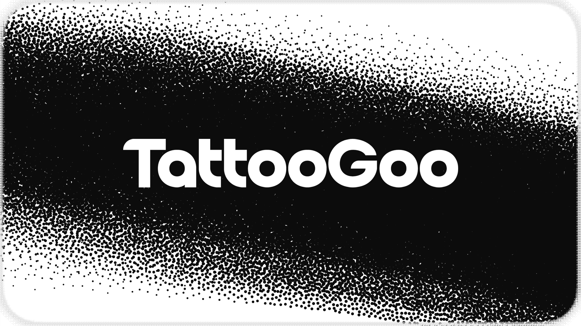
Wordmark
Using a modified version of All Round Gothic, inspired by classics like Avant Garde Gothic and Futura, we rounded leftward flat edges and used the thickness of the T's stem to determine the counter of the O's. The G and T's were leveled out to be the same height to give the wordmark a boxed, rectangle feel. The counter of the A also reflects to O's. These things together help the workmark feel cohessive instead of repetative.
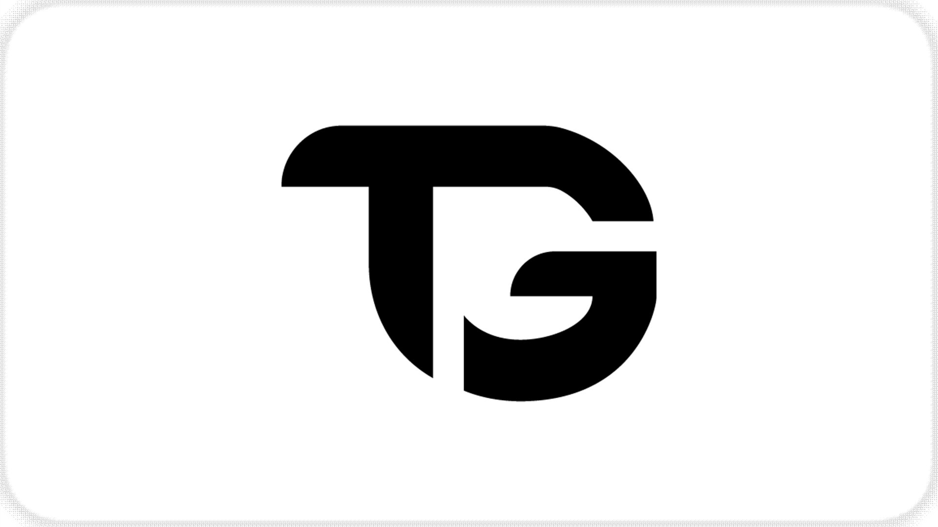
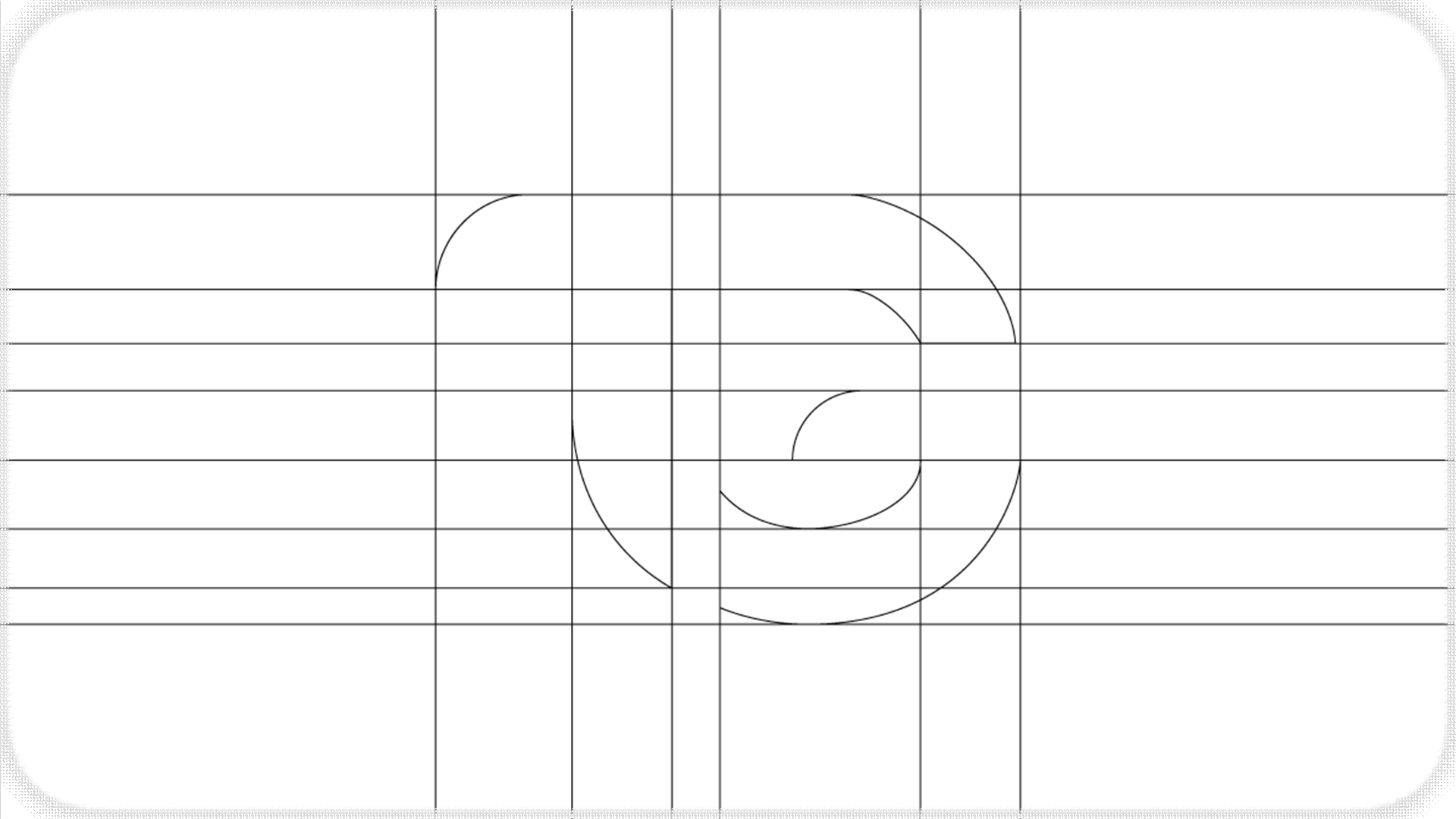
Lettermark
Combining the first two letters, we used the G's aperture to dictate the space separating it from the T, choosing the round the bottom of the T out into the G.
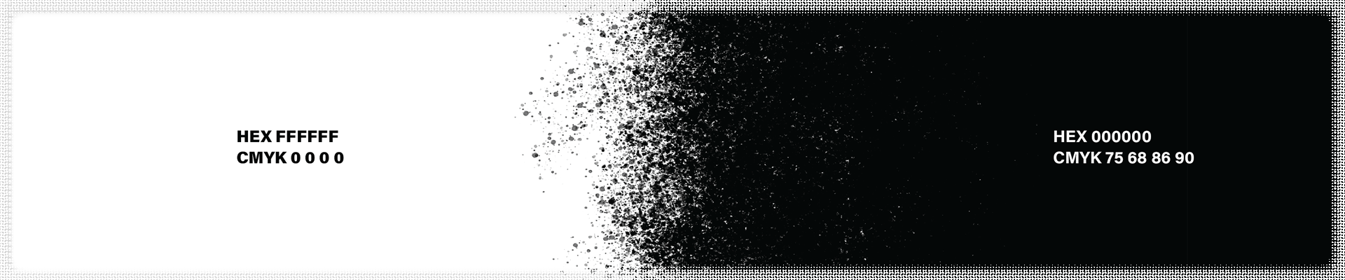
Colors
Keeping with the minimalism of our logo, we wanted to reflect that with our colors, the colors then influenced the packaging design.
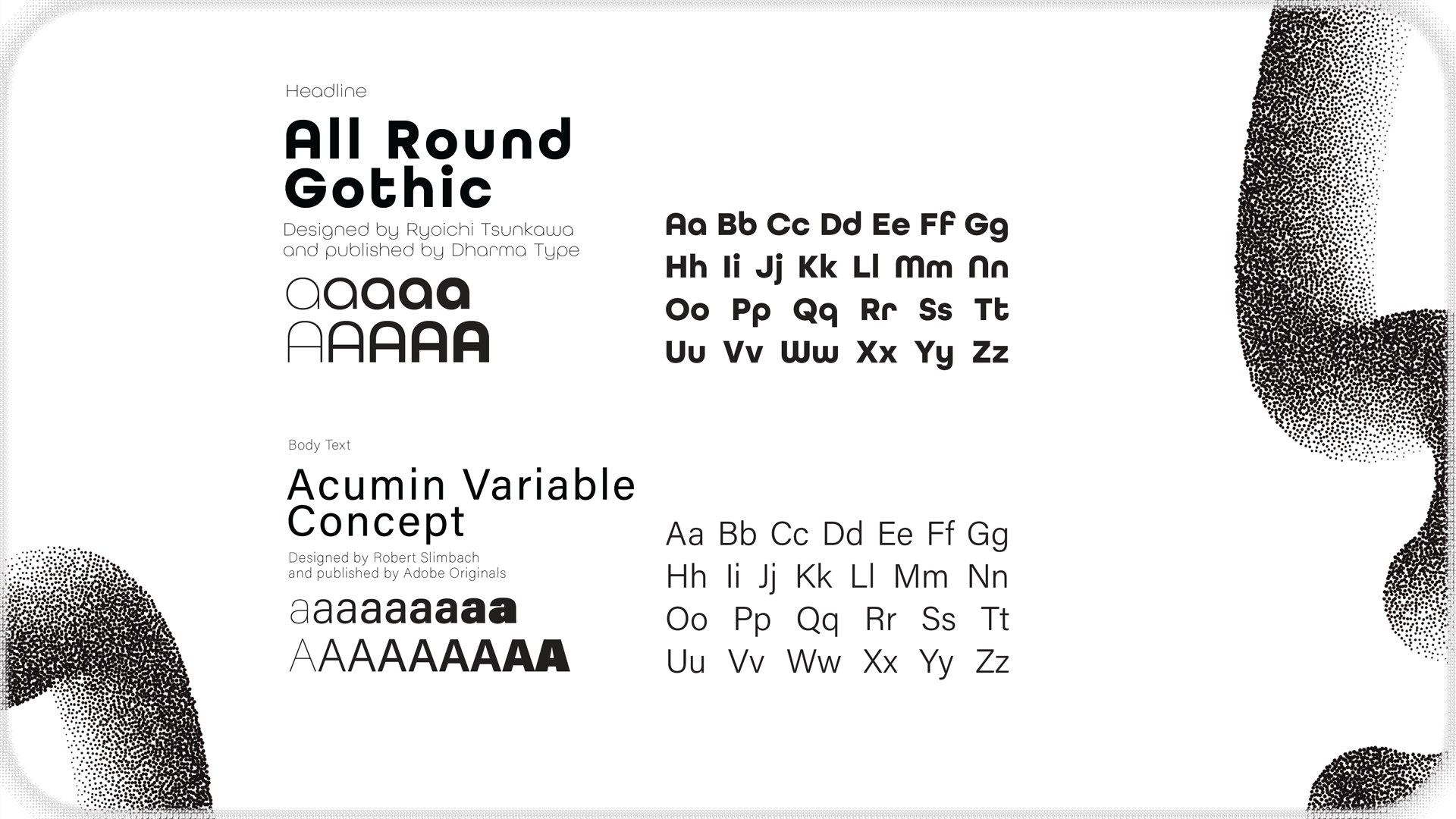
Typography
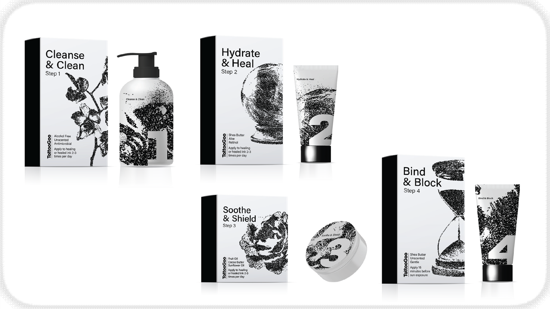
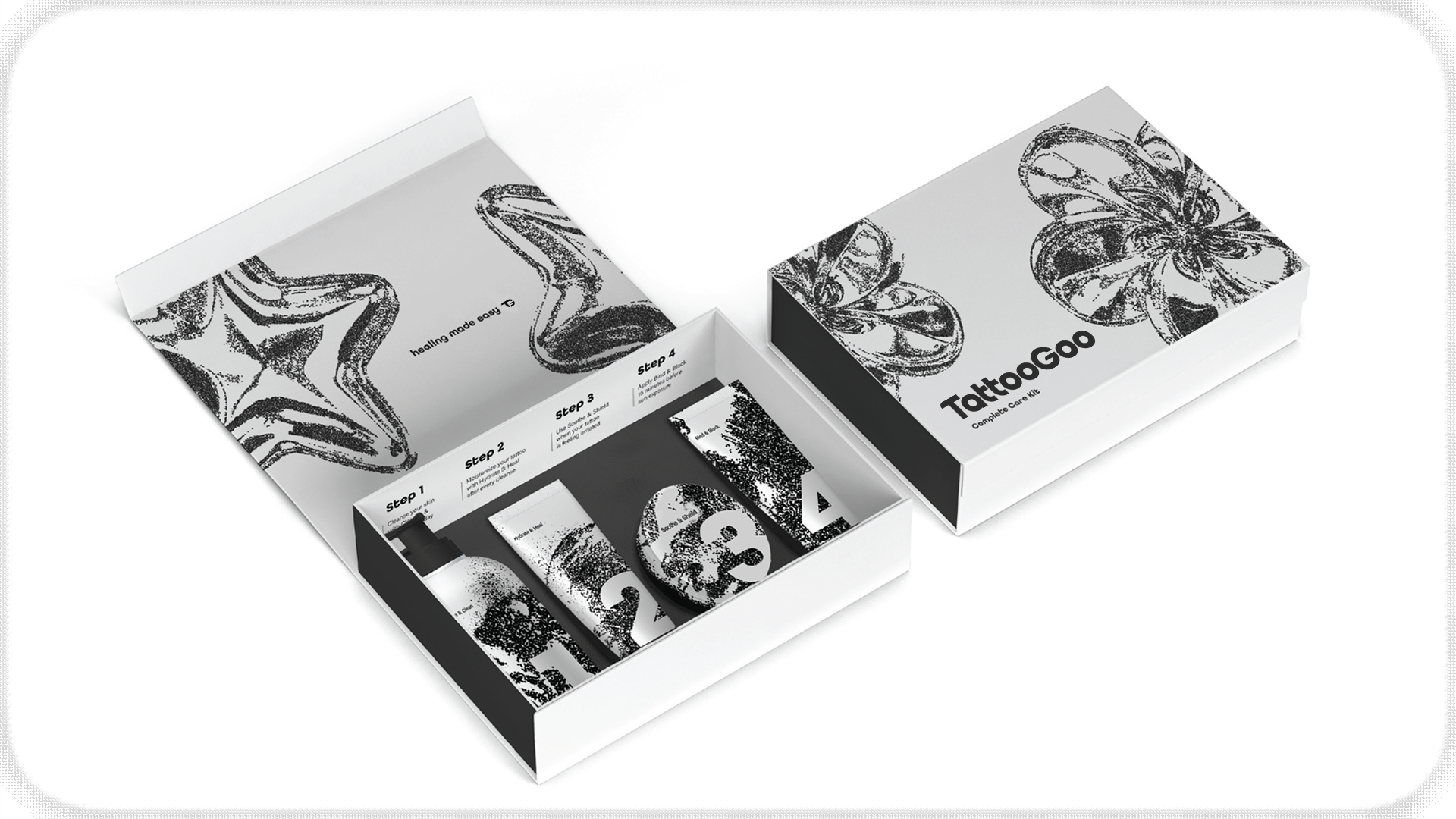
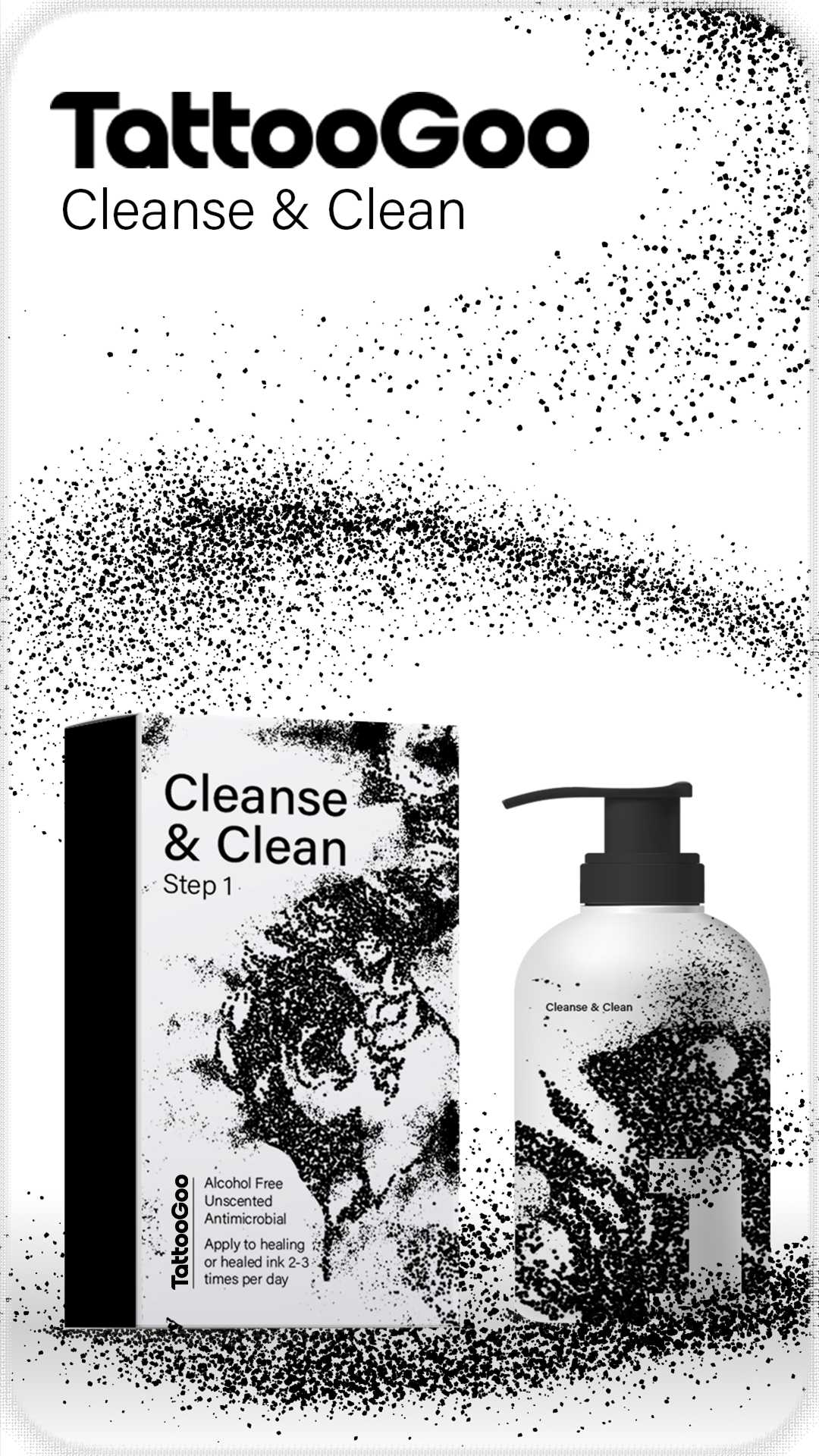
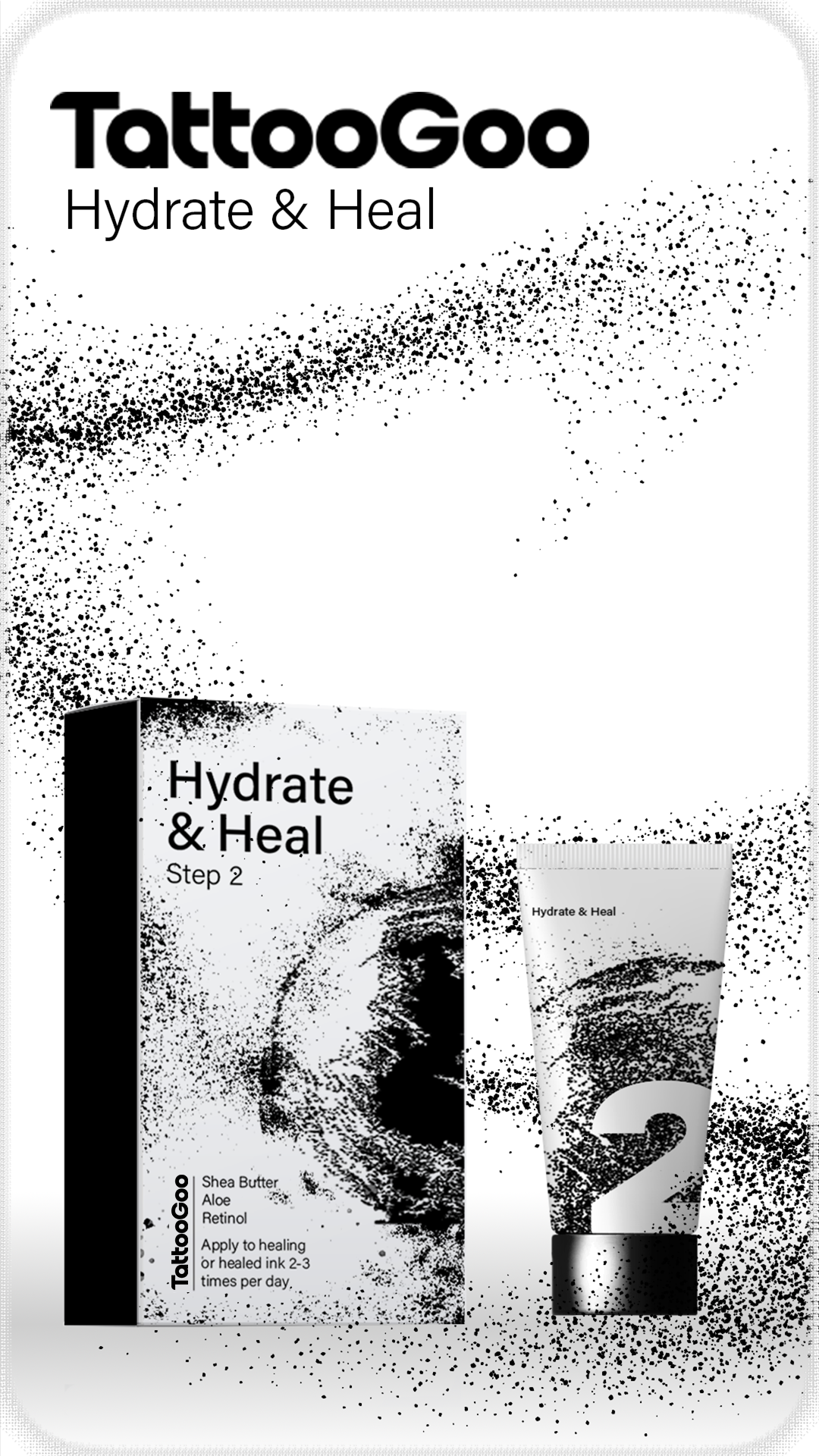
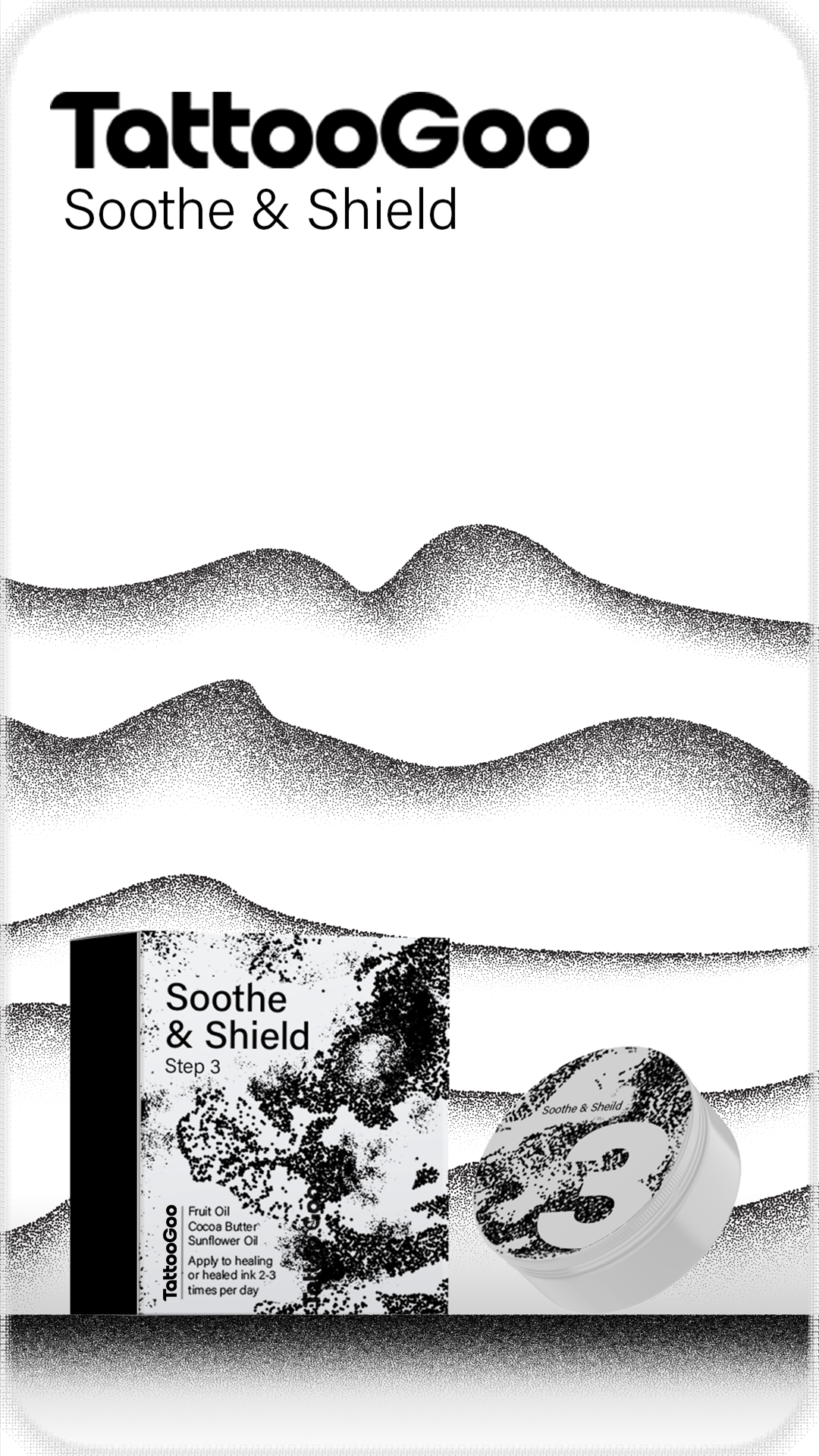
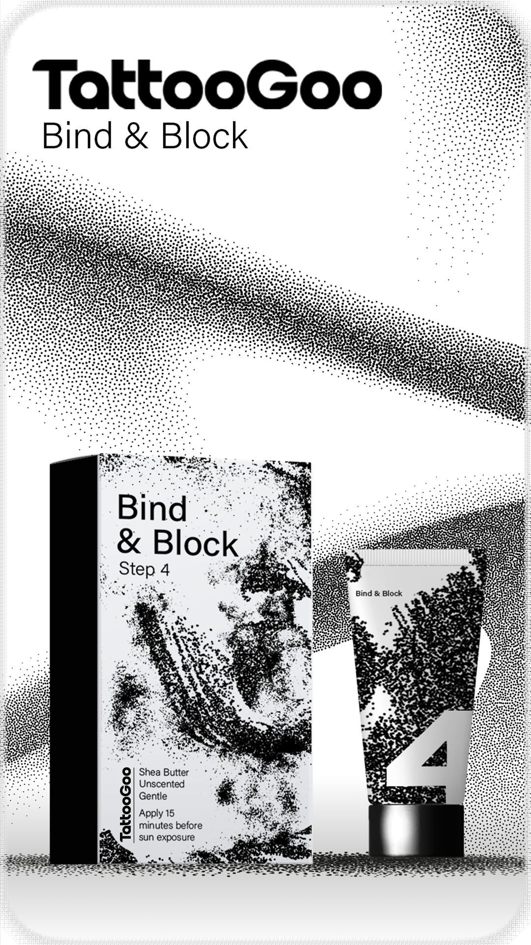
4. The Packaging
The main goal for the product is to keep your tattoos looking new, crisp, and keeping your skin healthy. The alliteration of the steps are meant to clearly and briefly convey what the specific step is for. This is when we settled upon the stipple designs and accent work seen on our products. The packages themselves have the design clearly visible but when the customers unbox the bottle, the design itself is enlarged, showing more of the stipple detail. Using negative space we also included step numbers with out products to keep it simple, to make a routine.
5. The Staging
Pulling more from the stippling, we developed these particles in a pen stroke motion and implemented them in our website, Instagram and magazine advertisements. Showcasing the endless possibilities that can be made with such a specific and limiting art style.

© 2026 Christian Mahoney, Ursine Design. All rights reserved.