CRAFT verb
craft (ˈkraft)
craft (ˈkraft)

Project Logo, Branding, Packaging
Tools Photoshop, Illustrator, Blender, ArcGIS Pro
1. Introduction
Branch & Bone Artisan Ales is a independent brewery located in Dayton, Ohio. The focus of our branding is to encourage conversation, community, and challenge convention. Wrapping our cans with art available to the public domain, or hand made like our beverages, nudging our guests to shop not only by flavor by but by which art speaks to them the most. By pulling pieces of art from our own history, this rebrand challenges typical branding conventions. We aim to invoke engaging conversations that draw people together and encourage them to support and cultivate creative spaces within their communities.
2. The Icon
It was important that the icon remain simple but stylized to stand out against the art on the cans. Using iterative steps
to determine the line weight and thickness of elements was a process refined after the initial round of sketches. Keeping the icon asymmetrical let the design maintain its organic quality and purposeful imperfections.
3. The Typography
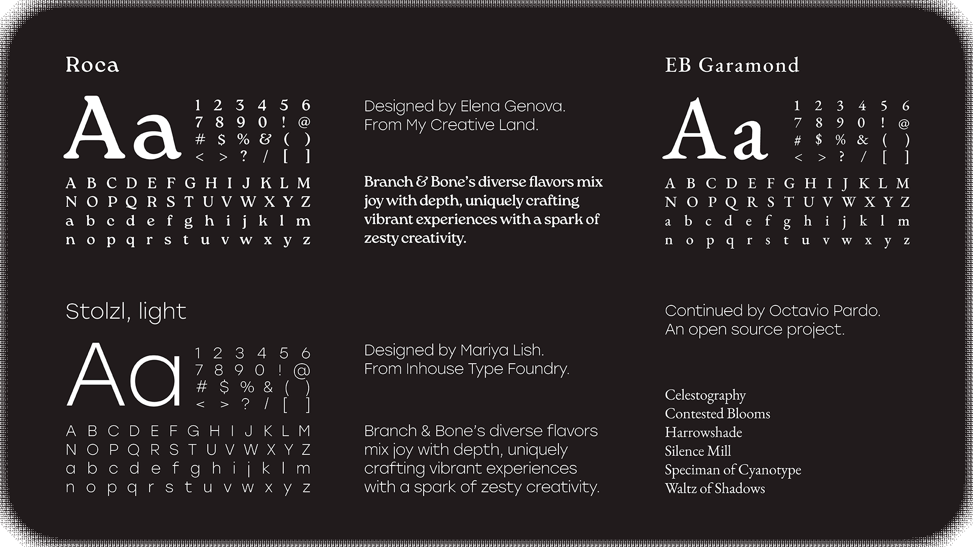
The hardest part about any identity is finding yourself within a font that can stand alone and invoke the proper feeling of your brand. Roca
is a soft serif steeped in the spirit of the 60s and 70s, it brings a comforting appearance reflective of the experience had in our taproom.
Stolzl Text is a modernist interpretation, stripped of the primary stylized attributes compared to it's display. The font is easily readable printed or on screen which makes it a perfect secondary font for the icon and our cans. Flavor information, fluid ounces, and the government warning are all set in the font.
EB Garamond is a free and open source implementation of Claude Garamond’s humanist typeface from the mid 16th century. A timeless classic that is readable, recognizable, and refined. A singular typeface was eventually chosen over various fonts that paired with each individual can. Though the latter was favored, it was important to think about the cost and ease of production when it eventually comes to designing.
4. The Application
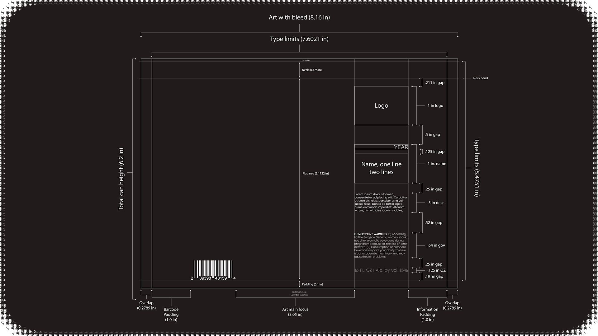
With how often new runs are released, it was important that we come up with a well defined system that let us draft, adjust, and produce with as little back and forth as possible. Outside of the artwork each standard production can only has two variables present to be edited; the name and the description. For special edition brews, the logo icon outline can be changed to a gold foil along with other aspects of the artwork edited and gilded to make it special.

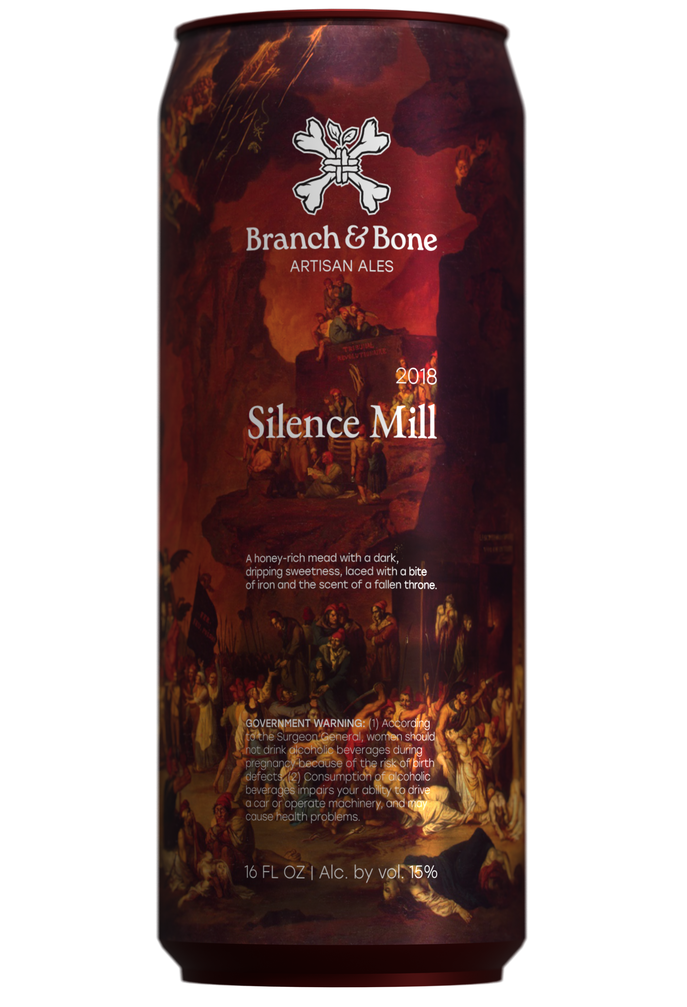
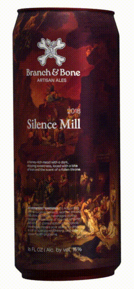
Silence Mill
Nicolas-Antoine Taunay, “Le Triomphe de la Guillotine” (1795)
"Does your government, then, resemble a despotism? Yes, as the sword which glitters in the hands of liberty's heroes resembles the one with which tyranny's lackeys are armed. Let the despot govern his brutalized subjects by terror; he is right to do this, as a despot. Subdue liberty's enemies by terror, and you will be right, as founders of the Republic." (Maximilien Robespierre, On Political Morality)
The Silence Mill is a mixed fermentation saison aged in a foeder, made with local honey. Tart and sweet body with a pale appearance, it called for an art piece that matched the flavor and name.
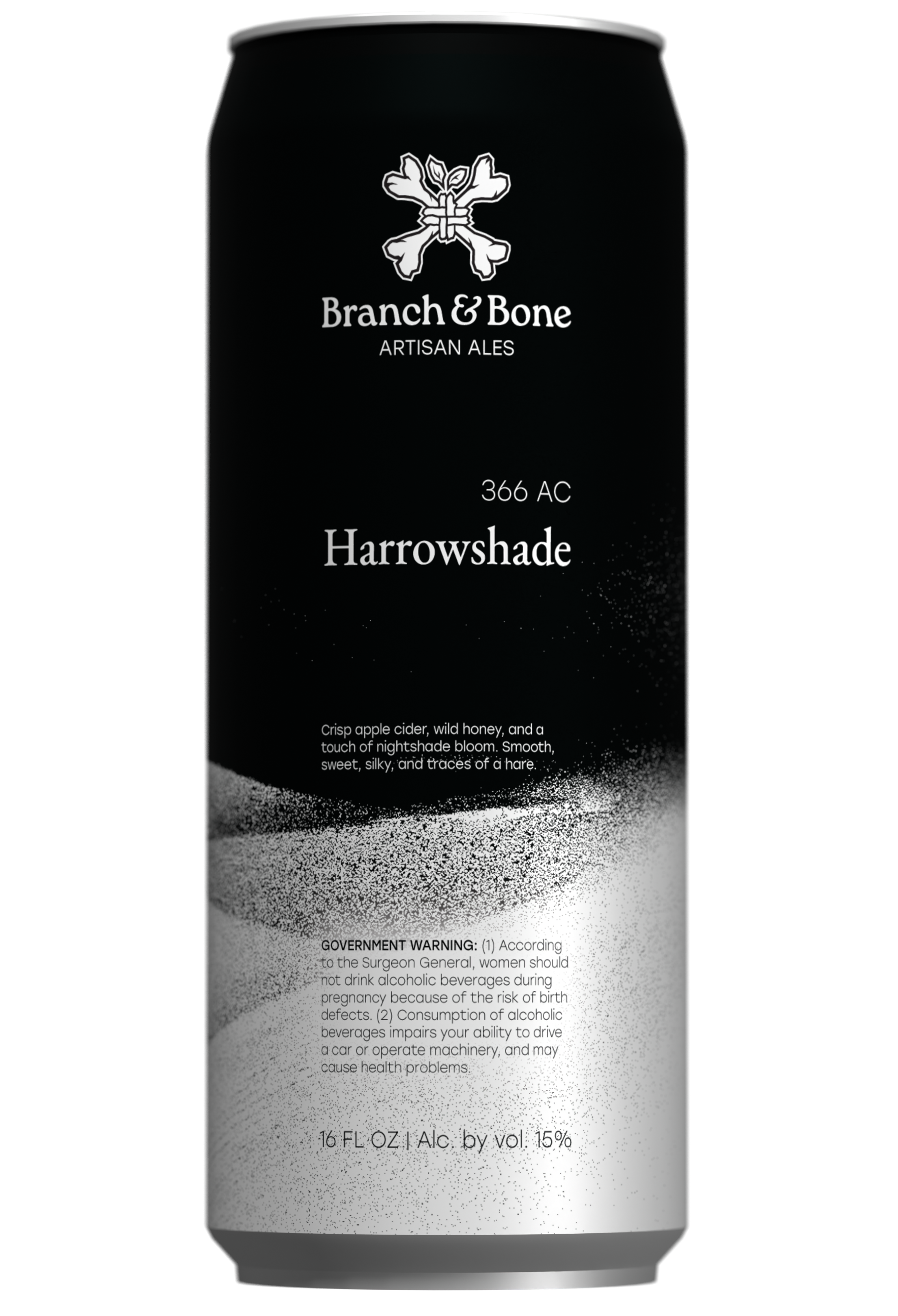
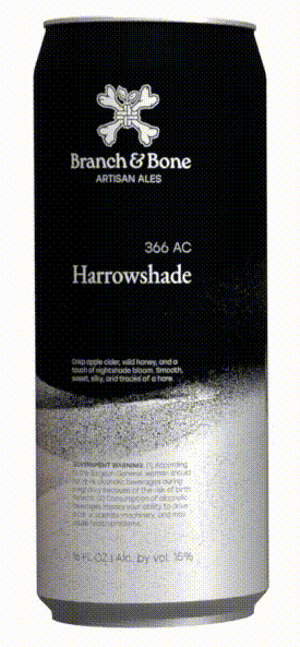
Harrowshade
Salfore Lutalica, “A Hearth Beneath the Ice” (366 AC)
"Since the Cataclysm of the Gods, the curtain has been lifted, it has become inescapable that we inhabit a world adrift in a sea of howling entropy, a terrible maelstrom in which all heavenly bodies orbit a devouring core." (Brena Black, Ecliptic Descent)
Harrowshade exists as a cozy oasis in the middle of a glacial desert; this apple cider blended with honey, and a touch of nightshade comes together to form cyser. A smooth, sweet, and silky apple honey wine that is good for any seasonal occasion.
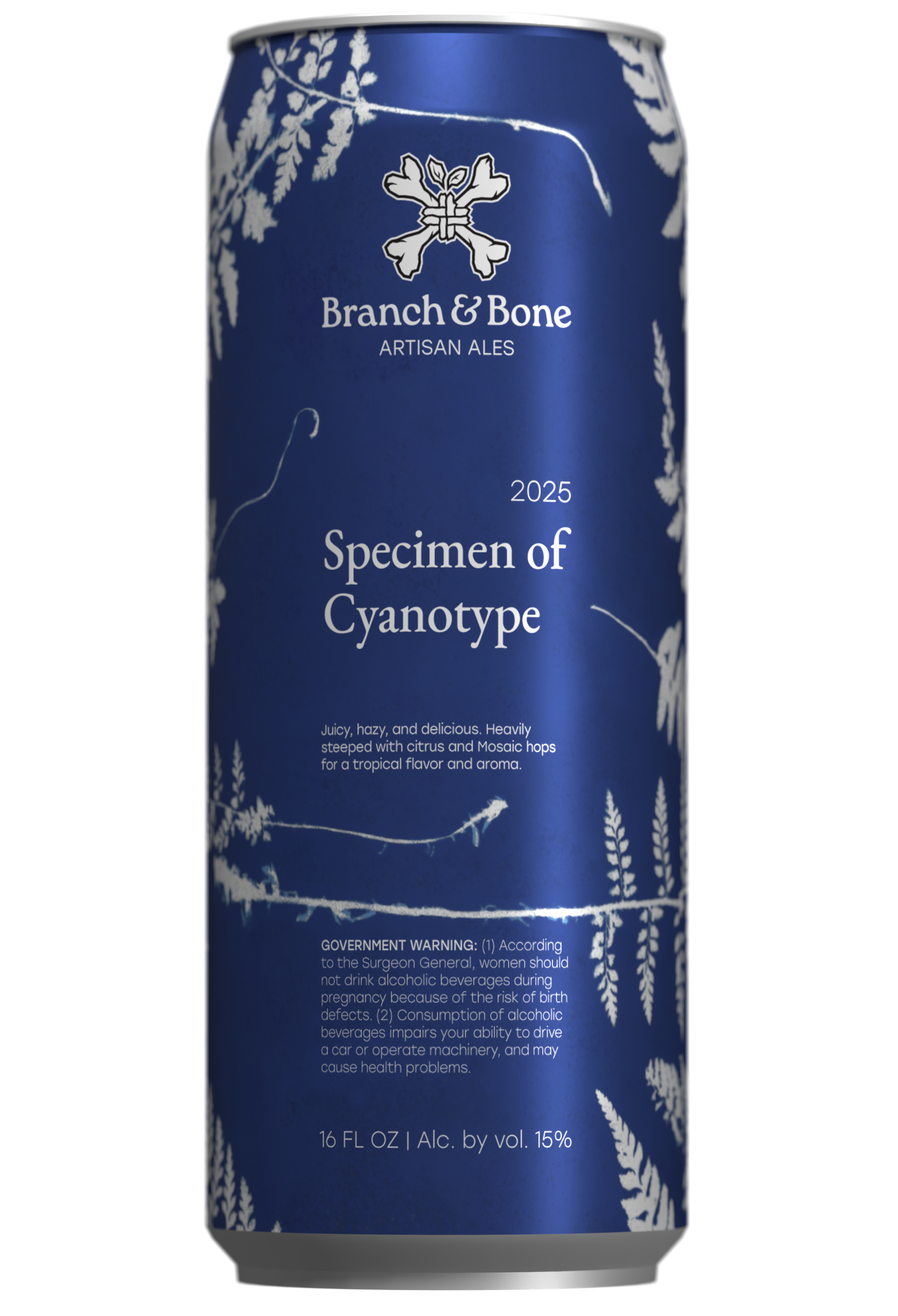
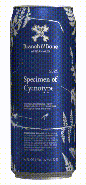
Specimen of Cyanotype
Anna Atkins, “Ferns. Specimen of Cyanotype” (1840s)
"The difficulty of making accurate drawings of objects so minute as many of the Algae and Confervae has induced me to avail myself of Sir John Herschel’s beautiful process of Cyanotype, to obtain impressions of the plants themselves, which I have much pleasure in offering to my botanical friends." (Anna Atkins, Photographs of British Algae: Cyanotype Impressions)
The first person to illustrate a book with photographic images, Ferns is just one of
the many that were included, using cyanotype. There are 411 plates in total for each
of the 20 known copies of her books. Anna is considered the first to make art with
the medium.
the many that were included, using cyanotype. There are 411 plates in total for each
of the 20 known copies of her books. Anna is considered the first to make art with
the medium.
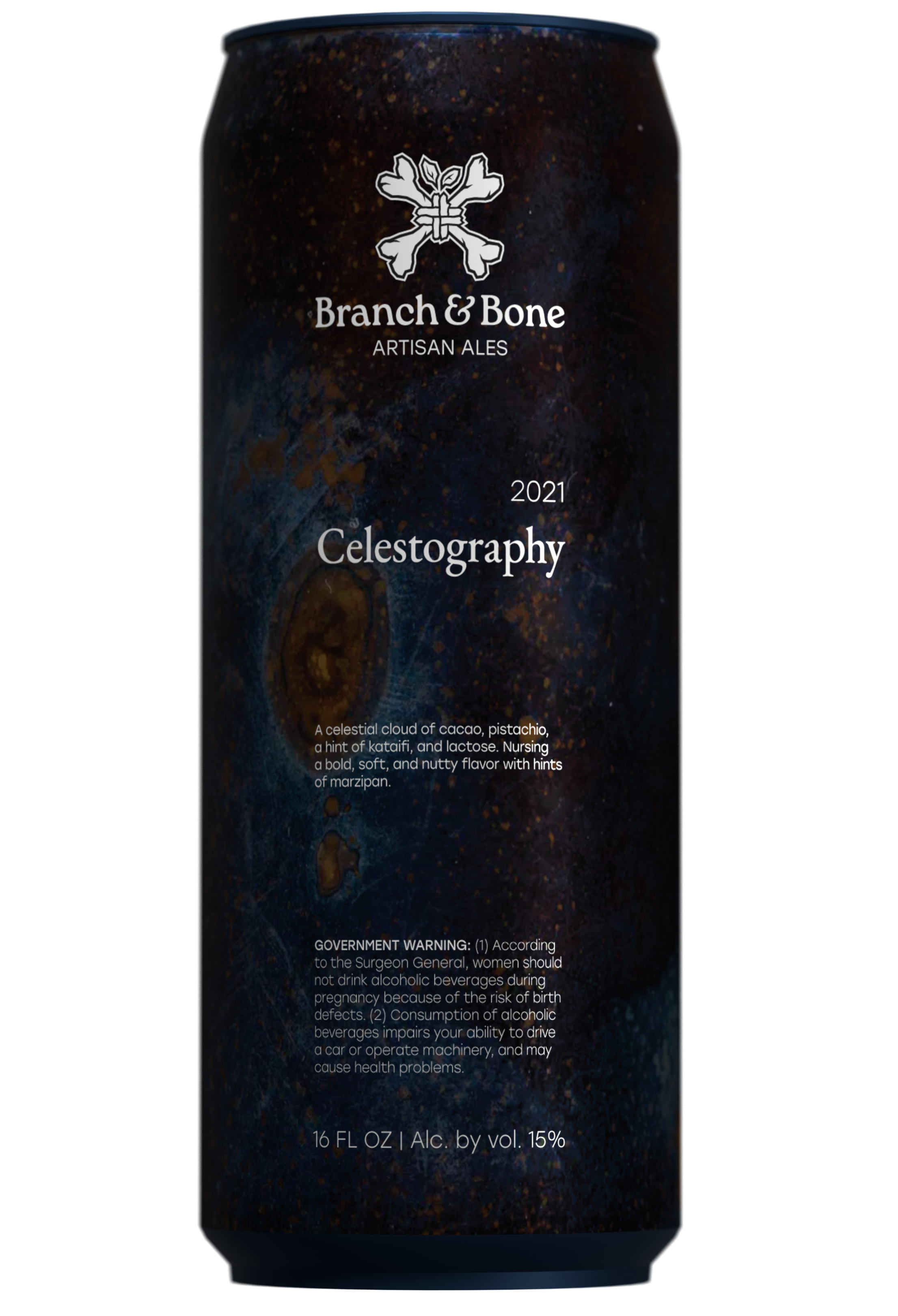
Celestography
August Strindberg, “Celestography” (1893–4)
"At first you see nothing but a chaos of colors; then it begins to look like something, it resembles — no, it does not look like anything. All of a sudden, a point detaches itself; like the nucleus of a cell, it grows, the colors are clustered around it, heaped; rays develop, shooting forth branches and twigs like ice crystals on the window panes… and the picture reveals itself to the viewer, who has assisted at the birth of the painting." (La Revue des Revues, Translated by Kjersti Board)
Celestography, literally to record or write (-graph) the stars or sky (celesto-); light sensitive plates exposed to the night sky. Chemigrams as they would soon be called, likely affected Strindberg's philosophy “Everything is created in analogies, the inferior with the superior.”

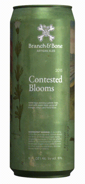
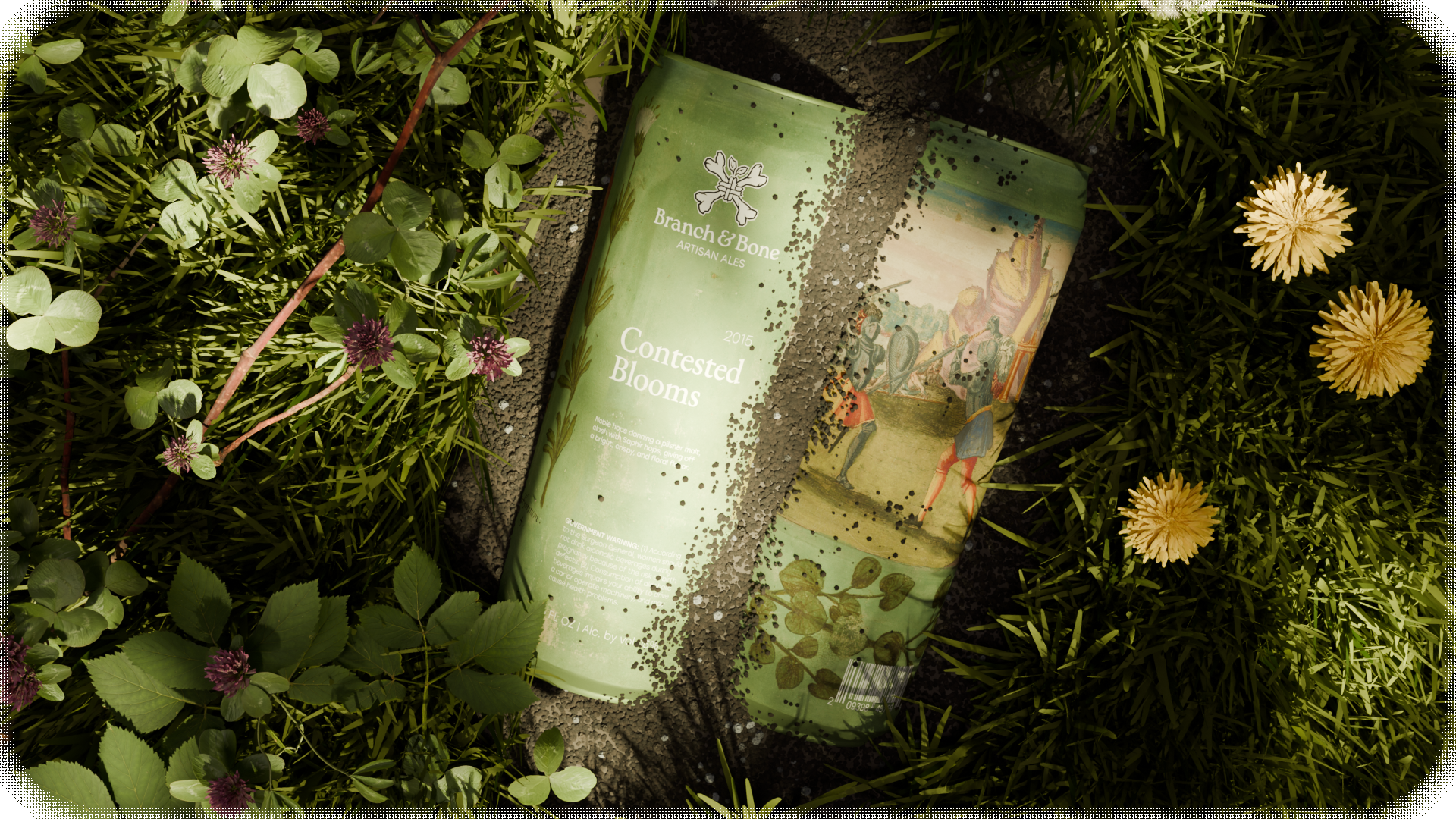
Contested Blooms
Wilhelm Dilich, “Description of the Christening of Lady Elisabeth of Hesse” (1598)
"Hedge, that divides the lovely
Garden, and myself from me,
Never in you so fair a rose I see
As she who is my lady," (Torquato Tasso, Hedge, that divides the lovely 1-4)
Garden, and myself from me,
Never in you so fair a rose I see
As she who is my lady," (Torquato Tasso, Hedge, that divides the lovely 1-4)
Some of the last knightly tournaments ever held in Europe were recorded with these illustrations. Flora motifs adorn to make the frames of thirty-five plus artworks. They were made to commemorate the christening of Princess Elisabeth von Hessen-Kassel.
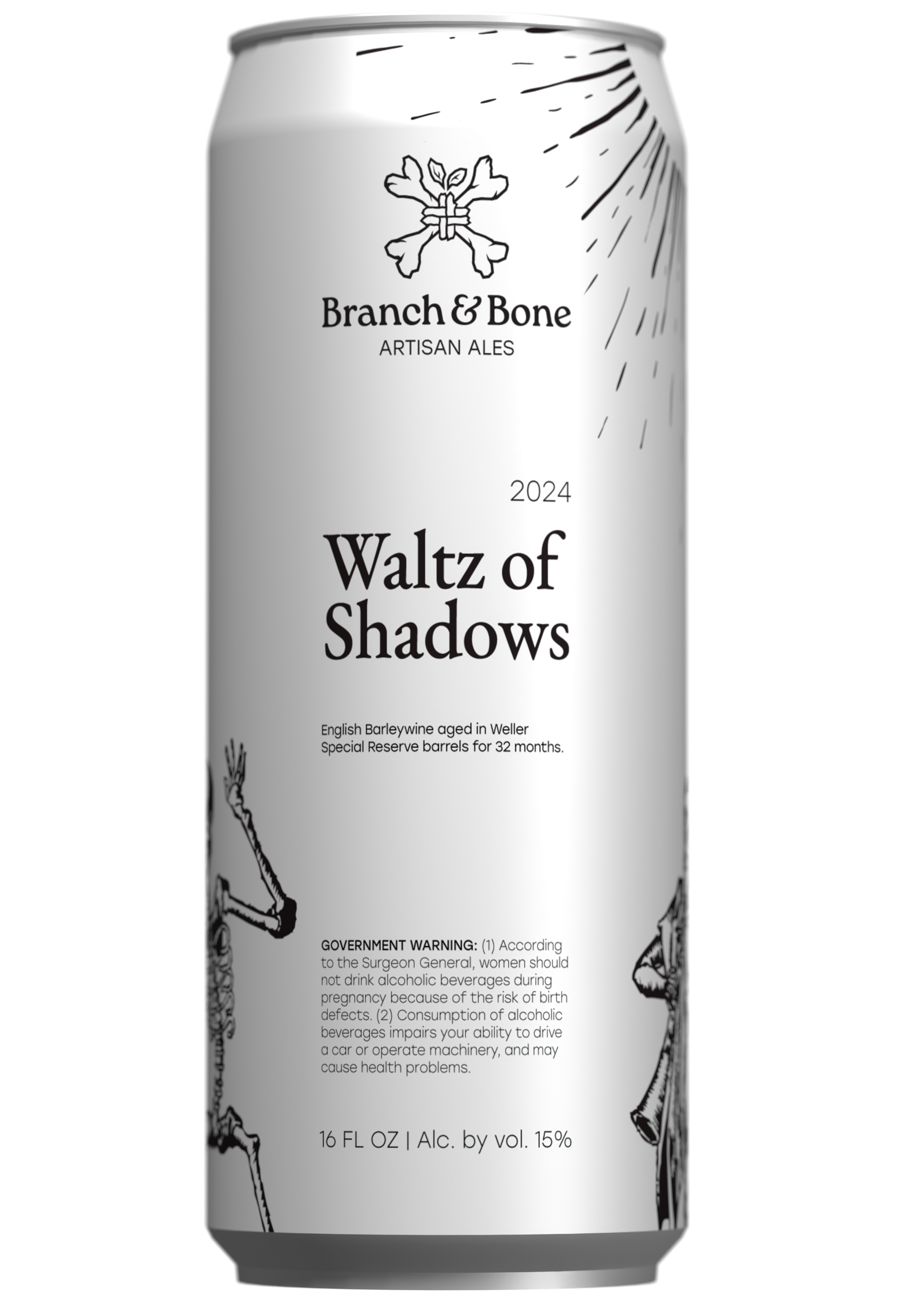
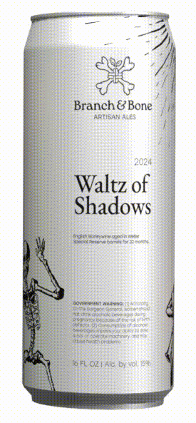
Waltz of Shadows
Michael Wolgemut, “Danse Macabre” (1493)
"The first rule of existence is: as above, so below. People are fractal images of the universe. You are as we are. Bad things happen to good people because things happen all the time, and it is up to people to determine whether they are bad or good. In the same way that your heart feels and your mind thinks, you mortal beings are the instrument by which the universe cares. If you choose to care, then the universe cares, and if you don't, then it doesn't." (Brennan Lee Mulligan, D 20)
An allegory on the universality of death, an artistic genre touting back to the Middle Ages. It was produced as memento mori, to remind people of the fragility of their lives and the vanity of earthly glory.
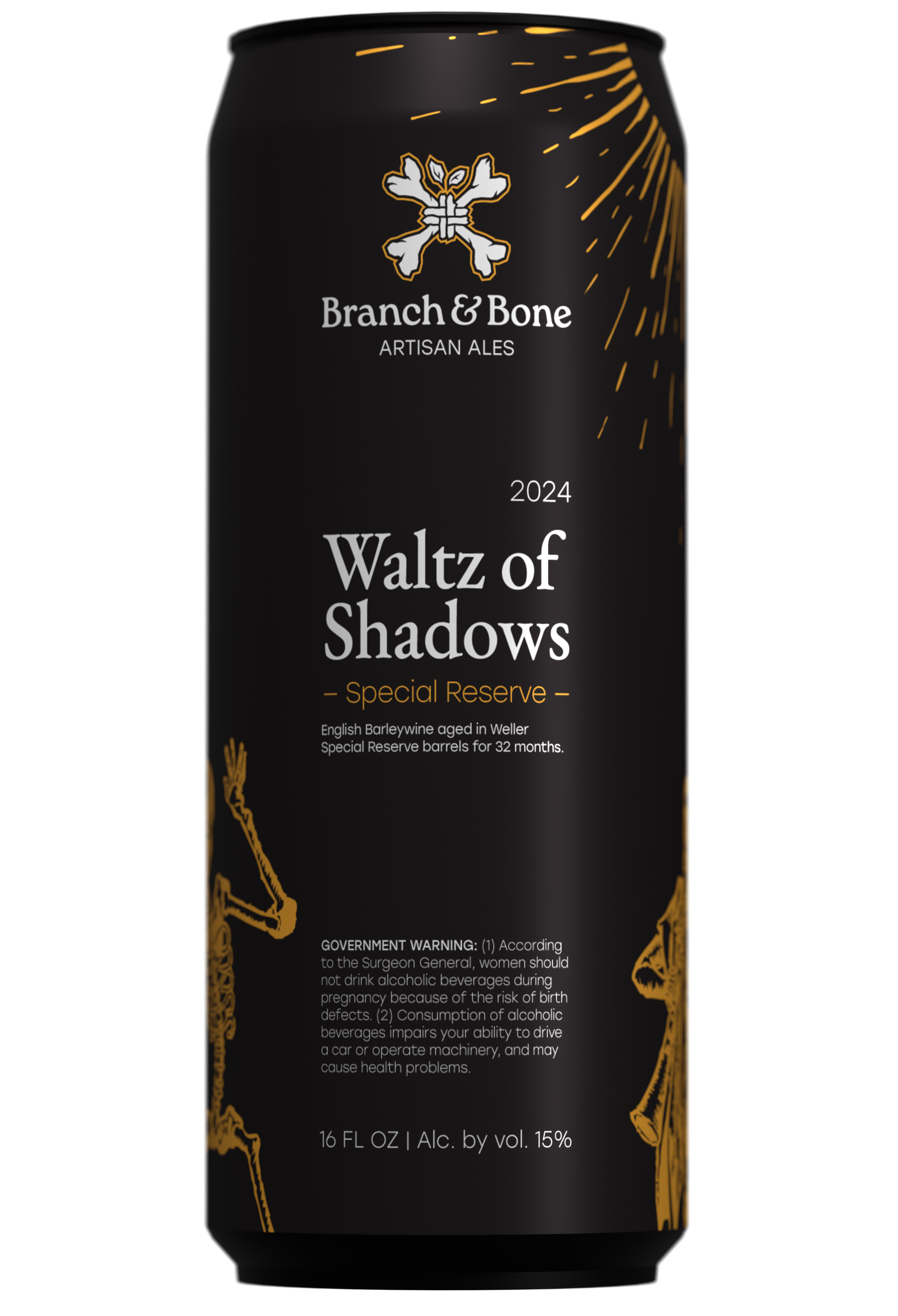
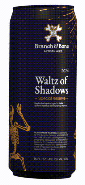
Waltz of Shadows, Special Reserve
Michael Wolgemut, “Danse Macabre” (1493)
"For strange eons had come to pass, and death itself had indeed finally died, and that which the long dead would have called the real was strange, and the living lived only because of the benevolent grace of an eternal lie." (Jennifer Diane Reitz, Caelum Est Conterrens)
For the special reserve of a can we wanted to play with the classic concept of lining things with gold and inverting the background to black. Another feature we decided upon was outlining the logo in gold instead of white, the only adjustment that is allowed to made to the icon on products.
5. The Ecosystem
Branch & Bone has a standing history within their community. Hosting a variety of events that include people of all ages, from children to elderly, they've pledged themselves to their community through their craft. A desire to create a balanced and flavorful product at the highest quality possible while contributing their passion to the community that surrounds them led to the founding of their brewery.
Onlyness statement
Tagline
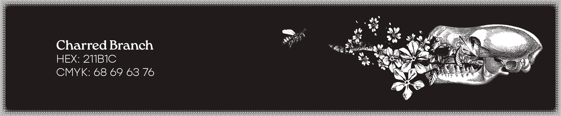
Brand Color
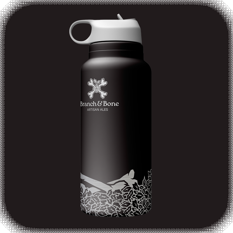
The main and only brand color is Charred Branch, #211B1C. A warm black picked for digital display with near-even green and blue values, it's pleasant on the eyes and makes for a nice backdrop in the taproom. Any ink on charred branch colored material will be in an opaque white or silver, whatever reasons clean and stays legible.
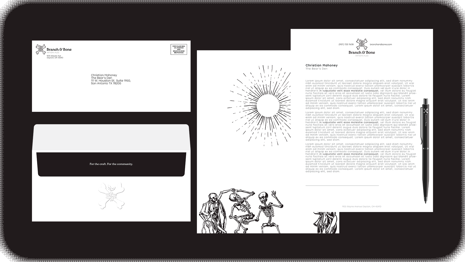
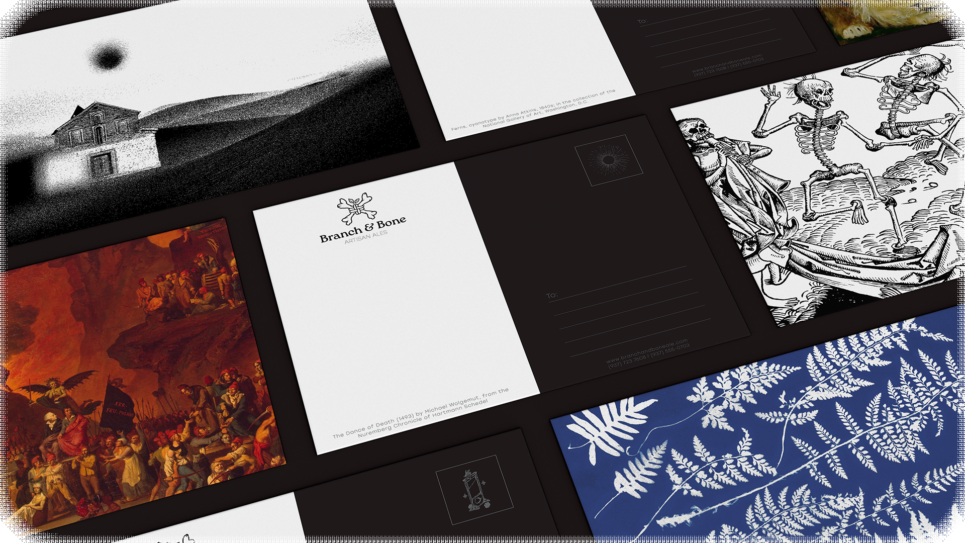
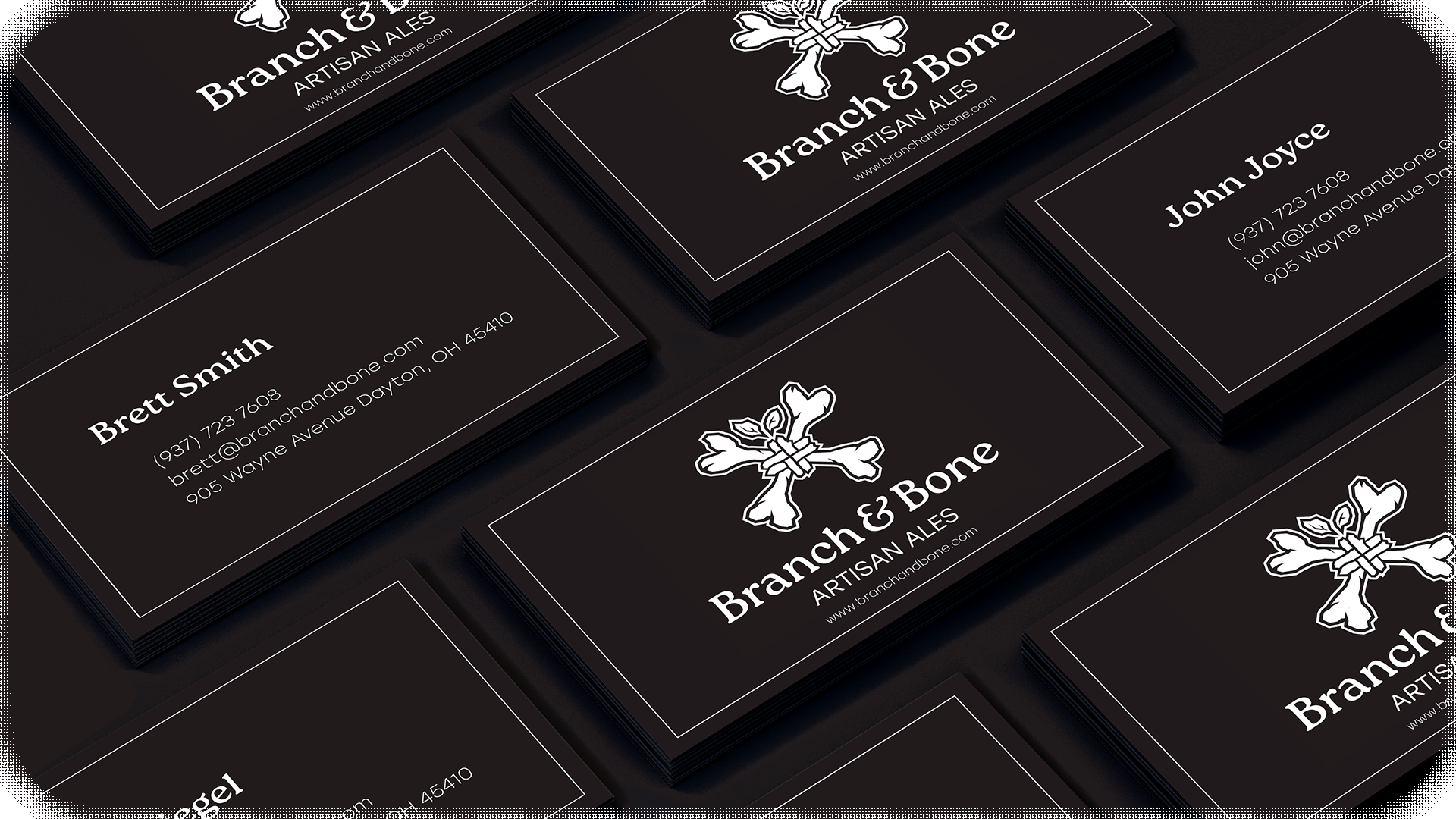
Stationary
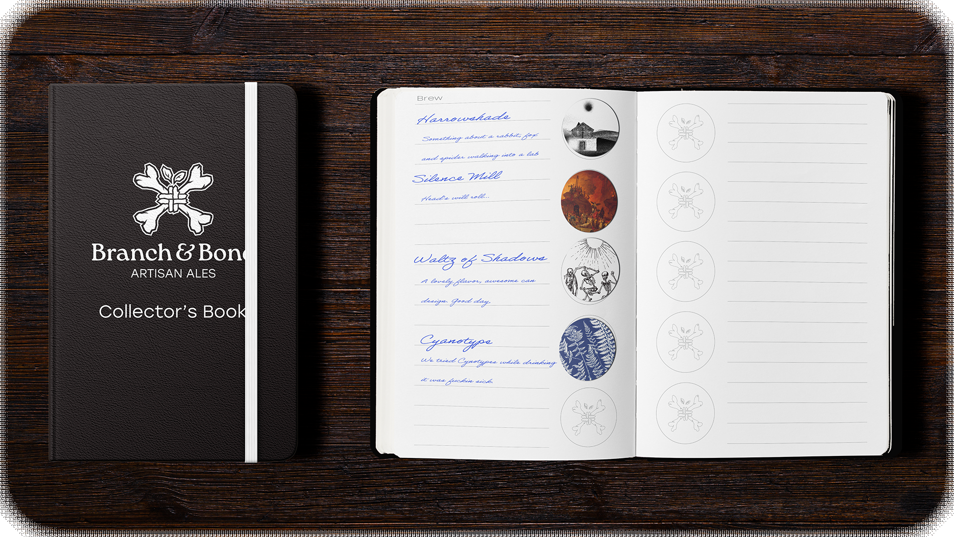
The stationary of Branch & Bone will remain consistent on one side and reflect the art of the brews on the other. This will come across on the backs of one page letters sent through mail, post cards, and stickers that can be collected with a sticker book. The stickers are available for free with any purchase of the associated brew.
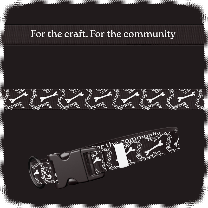
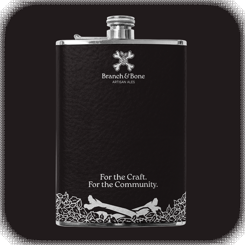
Merchandise
Making sure the community feels valued and is a part of the experience was an important part of this branding. What brings people back, gives people a talking point for others, and what brings them joy in our taproom? How can we stage our cans to match the art on them?


© 2026 Christian Mahoney, Ursine Design. All rights reserved.