STRONGHOLD noun
strong·hold (ˈstrȯŋ-ˌhōld)
2: a place where a particular cause is strongly defended or upheld.
strong·hold (ˈstrȯŋ-ˌhōld)
2: a place where a particular cause is strongly defended or upheld.
Project Branding, Storytelling, World Building
Tools Photoshop, Illustrator, Blender
1. Introduction
Harrowshade exists in the world of Athedaia on the western side of the continent Denanes in the middle of a glacial desert. A mana scar turning a once beautiful grassland into a frozen but not lifeless desert; undulating mounds of year round snow pushed by eastern winds. This project explored city branding using medieval techniques that were developed across a large time frame and many countries.
2. The Icon
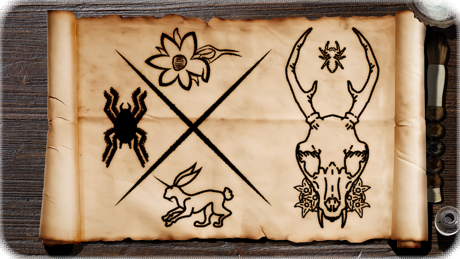
Last names hold power, in the medieval period and now, so an effort was made to explore the creation of an icon that could incorporate the last names of the three founders. Harrowfell, Lútalica, and Nightshade.
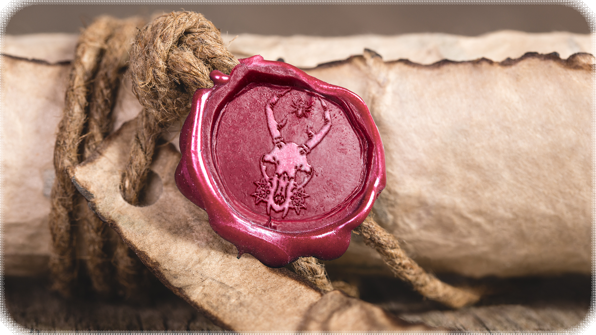
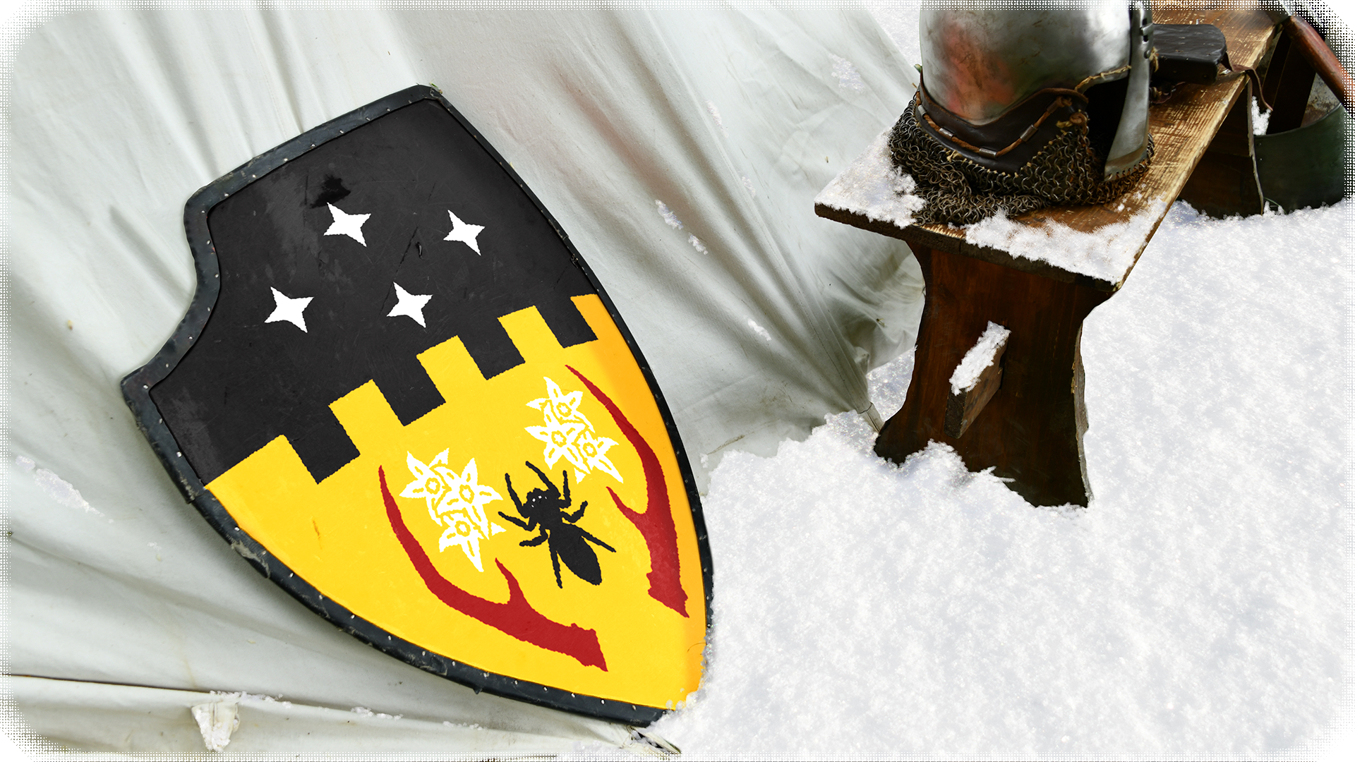
In nature, it's been known for spiders to make webs in the antlers of various animals, a mutualistic relationship for both the spider and the animal. The animal in question is a fanged jackalope, a mystical animal across many cultures. This harrowing skull and spider combined with the six blooms of deadly nightshade nestling it's cheeks, make the icon of Harrowshade.
Finally, Lútalica (loo-,tal-i-'kuh). A word referring to the sense that you're more than the categories that society puts you in. Soon after you were born, you were put in a little crate with a label slapped on it. It was nothing personal; and that was kind of the point. It was an easy way to keep things organized, so people could size you up at a glance and didn’t have to think about what was inside. Harrowshade rose to break those crates. Suggesting the idea that each of us will take the time to write our identities by hand, speaking only for ourselves, and in our own words. Taking our chances out in the open, meeting each other as we are, in all our entirety and strangeness. Finally gathering the courage to ask, “What is it like being you?”; while being brave enough to admit that we don’t already know the answer.
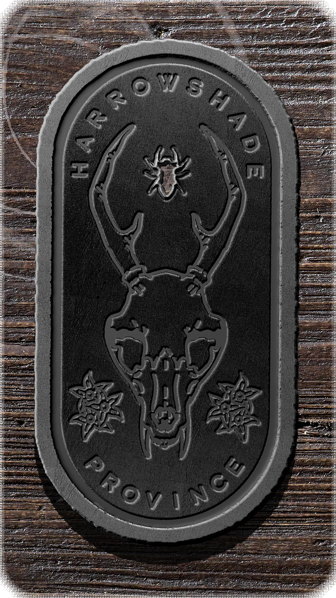
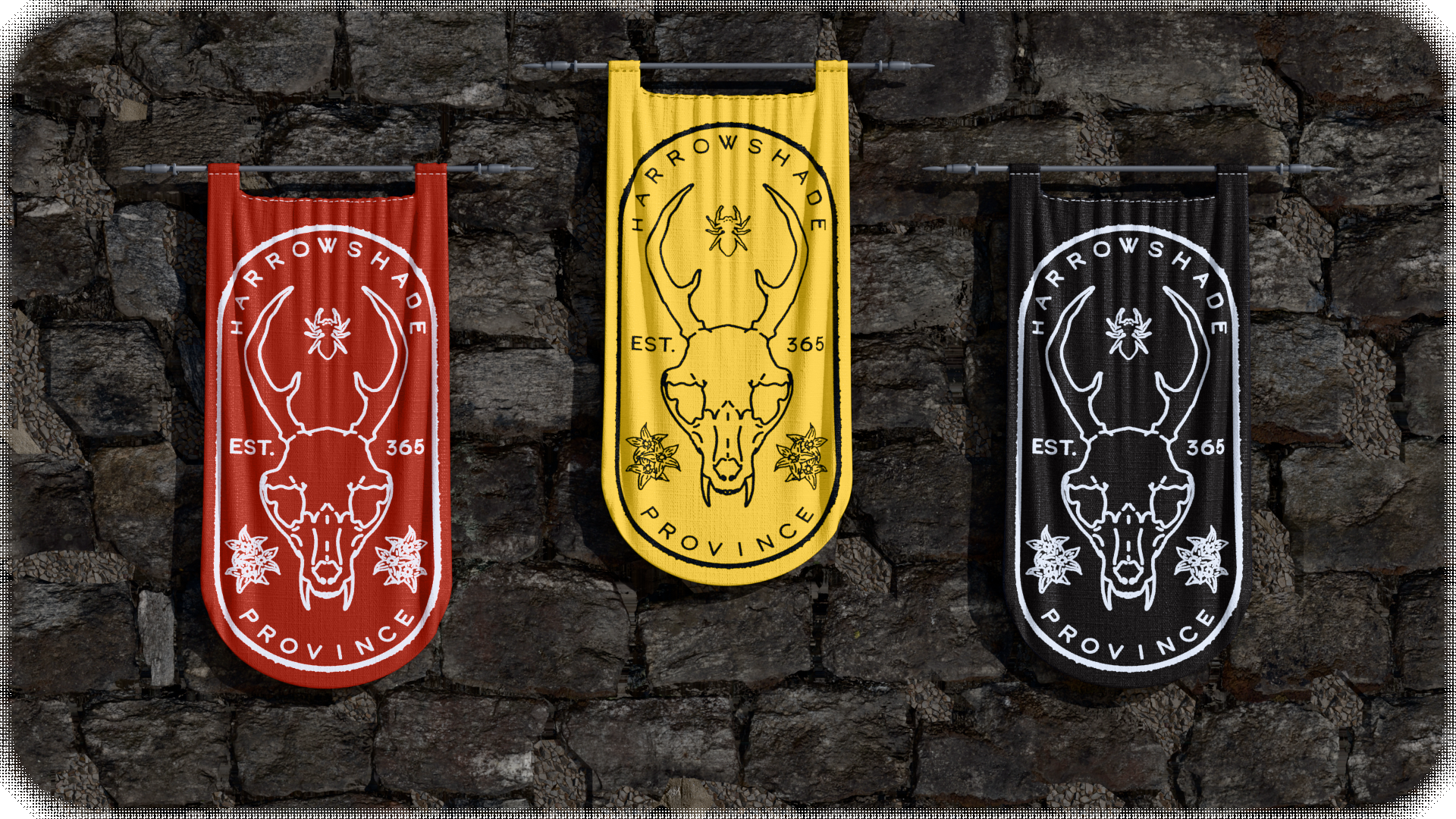
Harrowshade's full logo is the center image, framed on four sides by text with the nightshade bloom pushed out into the empty space, bringing a more filled out logo and token.
Historical Application
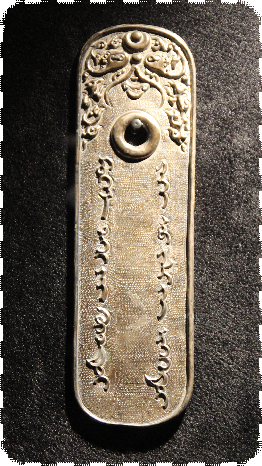
When researching historial applications of official design, one of the things that stood out the most was a Mongolian tablet of authority. Otherwise known as a paiza, paizi, or gerege. While it would've been appropriate to rely on heraldry for this city branding, it felt more appropriate to lean on Harrowshade's presence in regional trade amongst the cities. Existing along a intercontinental tram line, it allowed Harrowshade to cement itself in specific avenues of trade. Livestock, herbs, medicine, ciders, and beast products (such as remorhaz).
3. The Typography
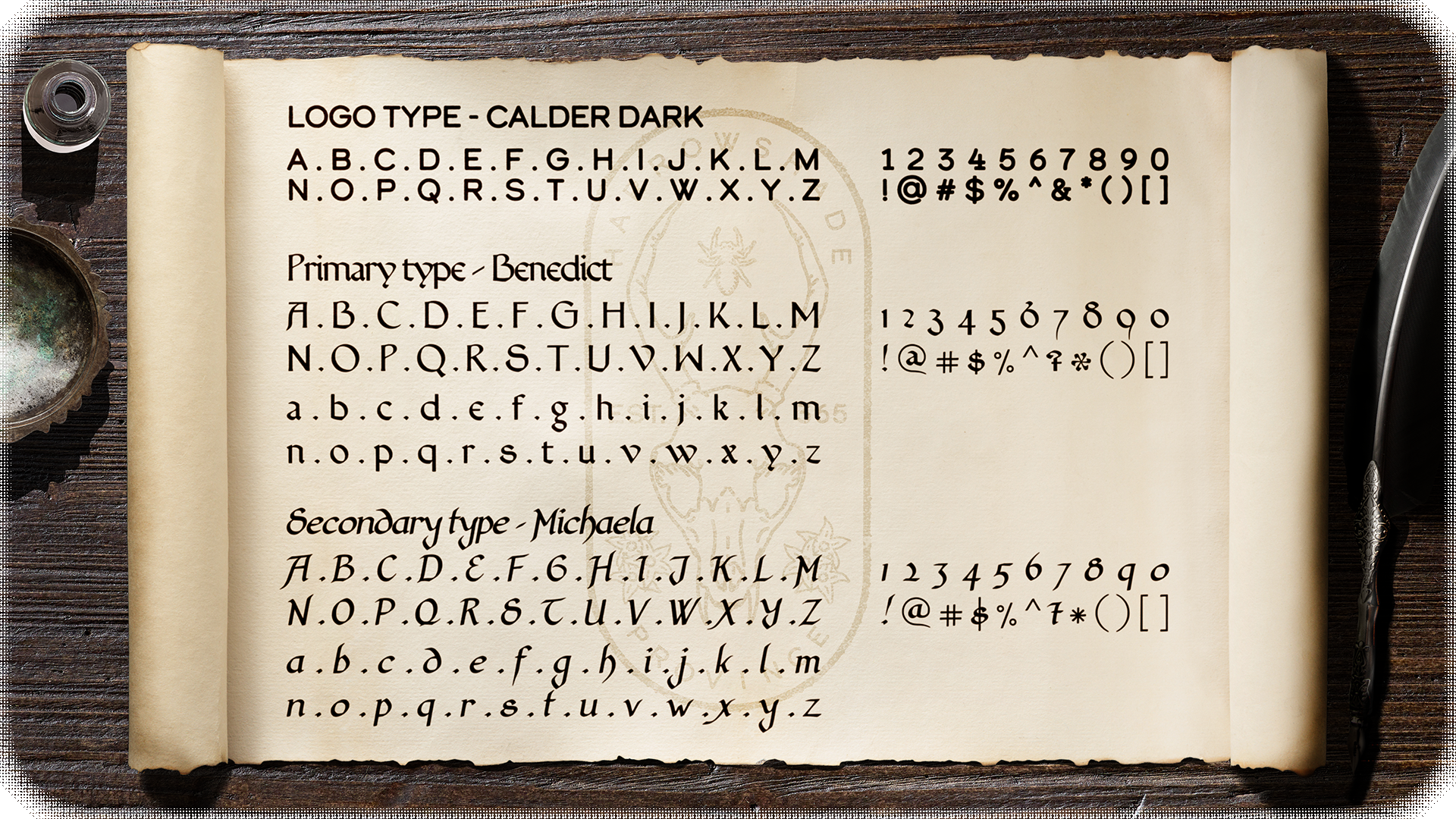
Calder Dark feels as if it could be an accurate production of clear text based of the time period Harrowshade exists in. The shapes are some that could be easily made into reliefs for a larger and repeated production of city material. Even circles, straight lines, and rounded edges made it a perfect fit.
Benedict, an original Gotico-Antiqua typeface, Michaela as the italic companion. Both are intended to match well visually with artwork in a medieval Gothic style, yet to be more easily legible to modern eyes than blackletter. Created by Daniel Mitsui, it's intended use is for written heading, subheading, or body text on paper or screen.
4. The Community
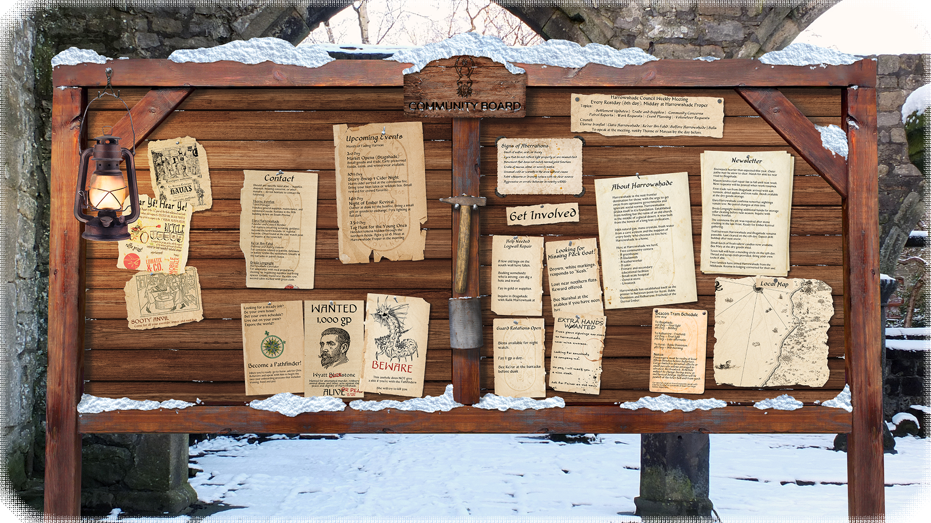
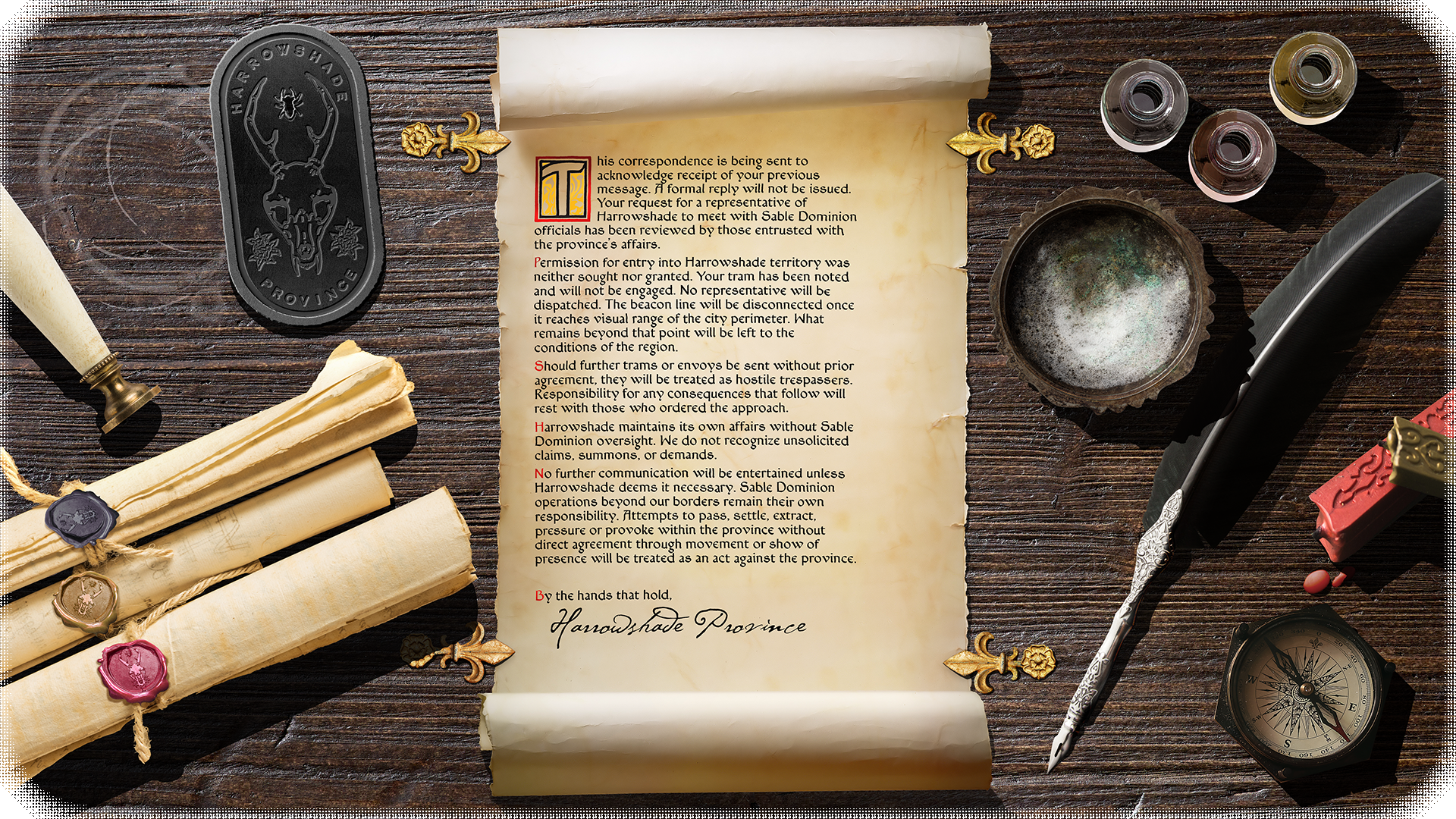
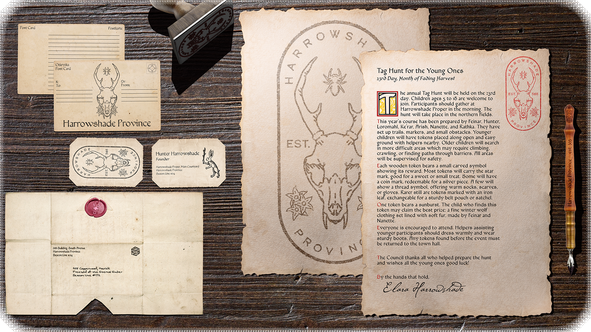
How could a city website be interpreted in a time without computers? A physical bulletin board in front of the city center or other essential locations where people gather socially. This board functions similar to a modern day website; jobs, warnings, bounties, events, contact information, advertisements, and even an about page for passing visitors.
Ancient Athens had an official bulletin board (the Monument of the Eponymous Heroes) in the 5th century BC. The messages were posted on white boards (leukomata) and included temporary notices: the lists of epheboi, mobilization lists, legislation proposals, announcements of prosecutions.

5. The Ecosystem
Branch & Bone has a standing history within their community. Hosting a variety of events that include people of all ages, from children to elderly, they've pledged themselves to their community through their craft. A desire to create a balanced and flavorful product at the highest quality possible while contributing their passion to the community that surrounds them led to the founding of their brewery.
Onlyness statement
Tagline
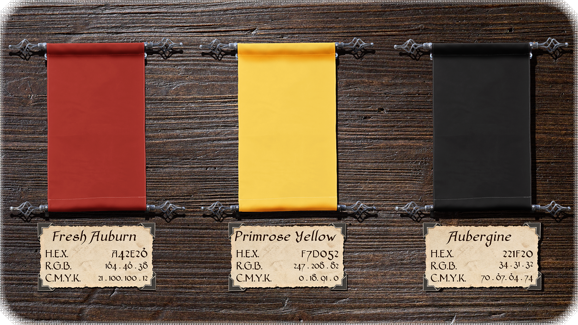
City Colors
The chosen colors of Harrowshade were picked in opposition to a founder birth family colors. Regardless of the origins, they've come to represent something more; a cycle of incandescence and rebirth. The gradient of deep, abyssal darkness transitioning into a golden sunrise embodies the Harrowshade's philosophy. "Dawn comes after darkness, rebirth comes after death, and union comes after division."
Stationary
Harrowshade exists in a more medieval type of setting but the goal was the explore the applications of some period accurate stationary and then a more modern approach.
Merchandise
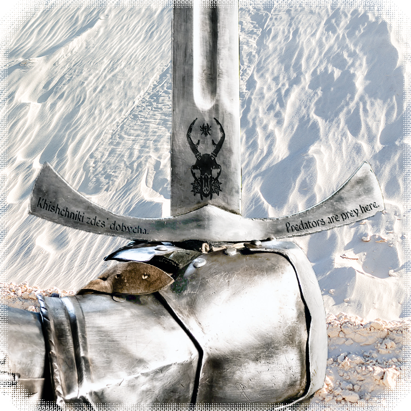
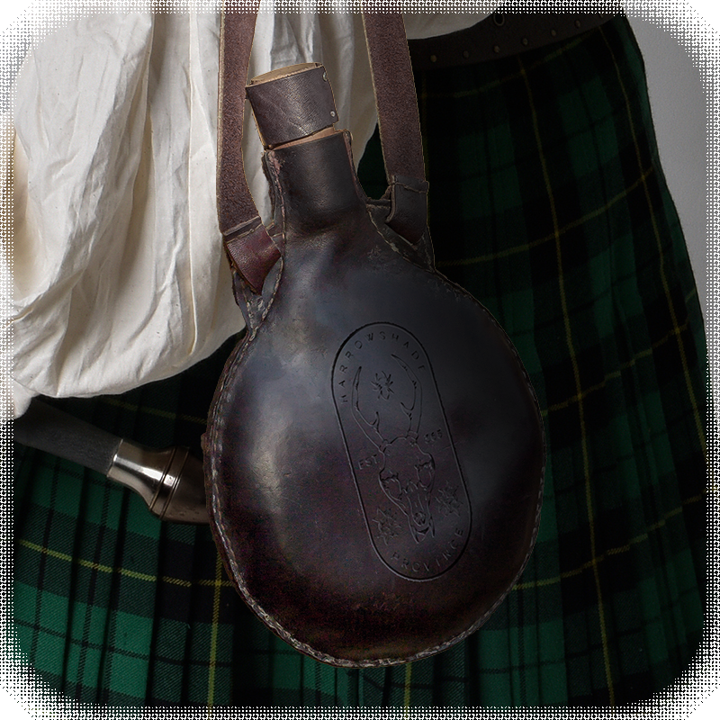
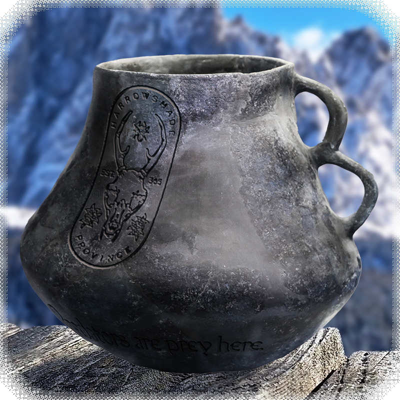
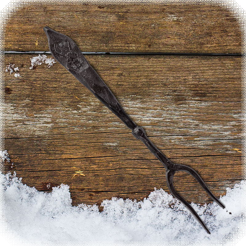
It would be easy to pick some classic merchandise that are commonly found at renaissance festivals and other businesses shaped around the medieval period. A shield bearing the Harrowshade coat-of-arms, sword with the tagline in two languages, waterskins, pottery, and cutlery.
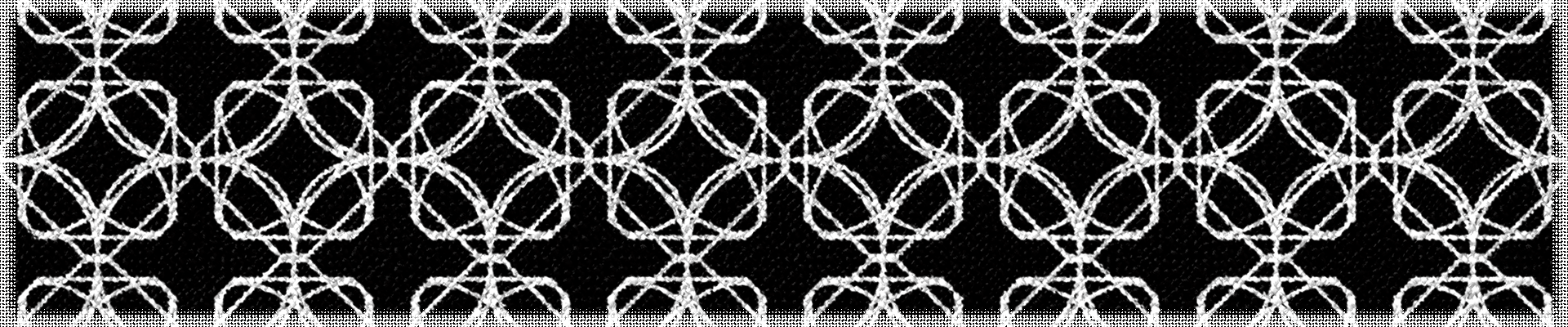
A repeated stitch pattern was designed out of stars, squares, circles, and ellipsis to make a beautiful trellis type of pattern. The pattern itself then was applied to some of the stained glass art found around Harrowshade. Notably the rose window that lies above the only entrance to the town hall.
6. The Explanation
The town of Harrowshade exists in a world shaped by D&D 5e with some very specific homebrew aspects.

© 2026 Christian Mahoney, Ursine Design. All rights reserved.