INTERCONNECTED adjective
in·ter·con·nect·ed (ˌin-tər-kə-ˈnek-təd)
2: having internal connections between the parts or elements
in·ter·con·nect·ed (ˌin-tər-kə-ˈnek-təd)
2: having internal connections between the parts or elements
Project Art Direction, Branding, EGD
Tools After Effects, Figma, Illustrator, Photoshop
1. Introduction
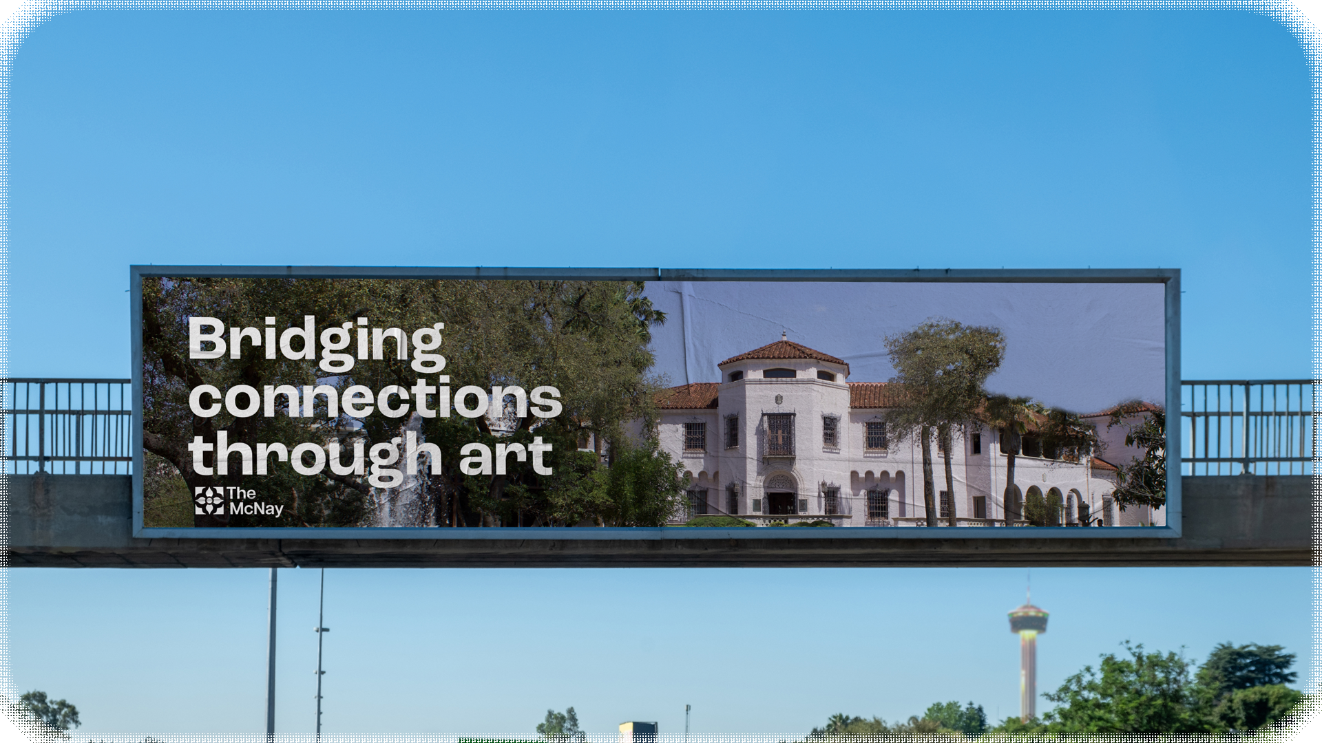
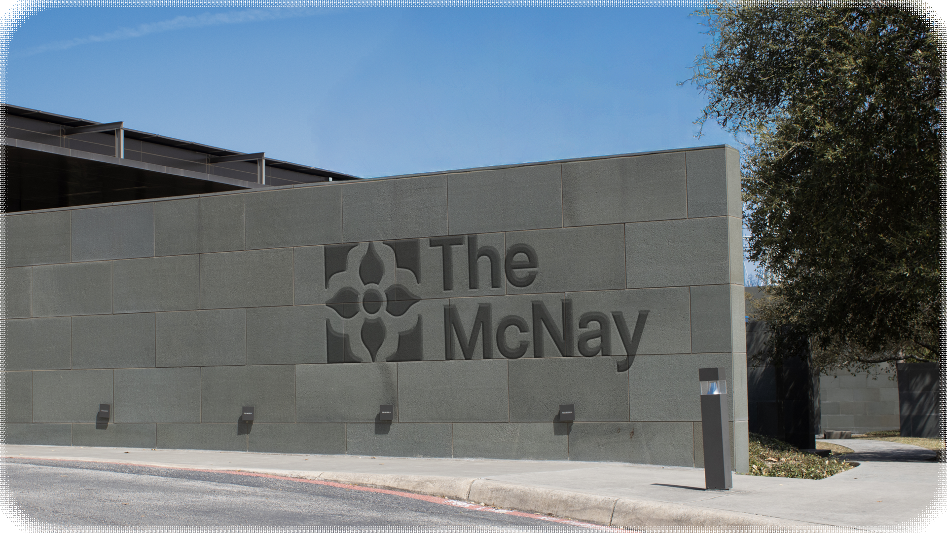
The McNay is the first modern art museum in Texas, it's located on a 25 acre campus in San Antonio. The community and culture of Texas are present inside and out, offering endless opportunities for people to engage with their own community through discovery and enjoyment of the visuals arts. Since 1950, the McNay's collection has expanded to more than 22,000 works including medieval, renaissance, European and American paintings, sculptures, and photographs.
2. The Positioning
Core Values
Integrity, Innovation, Excellence, Equity.
Vision
The McNay is San Antonio’s place of belonging,
where the Museum’s expanding community
is reflected in transformational and inspiring
art experiences.
Mission
The McNay Art Museum engages a diverse community in the discovery, connection, and enjoyment of the visual arts.
Onliness
The McNay bridges past and present, cultivating art that inspires and unites diverse communities.
Tagline
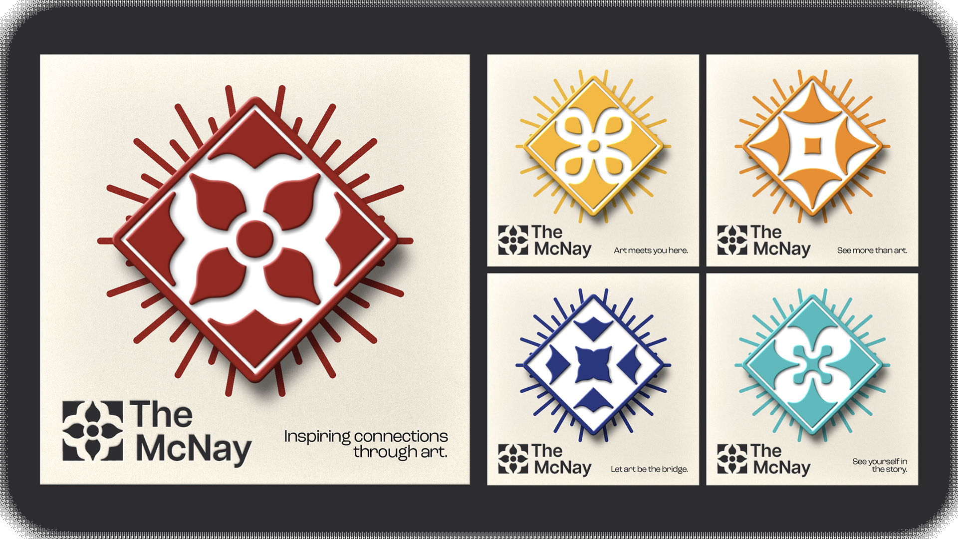
Inspiring connections through art.
3. The Visuals
Static Logo
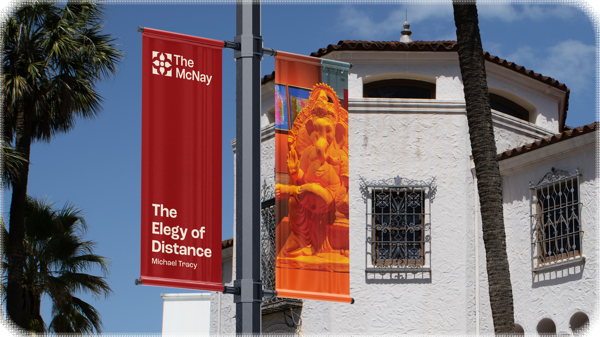
Pulling inspiration from the tiles present along the walls and the stairs of the Museum, a symmetrical floral design grew. The Spanish colonial architecture and the purpose of the location itself, lead us to developing a simplified historic tile mark. Paired with Articulat CF, a modern and minimal Sans Serif, it became a solid badge worthy of such a revolutionary location.
Tile System
It wasn't enough to just have one simplified tile shape, like the Museum itself, there is more than one beautiful piece in a gallery worth looking at.
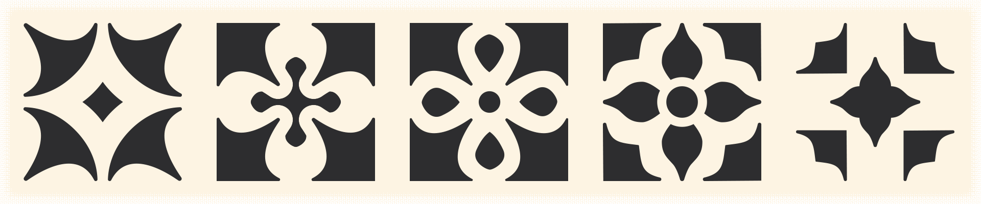
We developed five separate tiles and then morphed them together to create a a dynamic logo and symbol set. A set of icons that could represent different parts of the campus itself.
Dynamic Logo
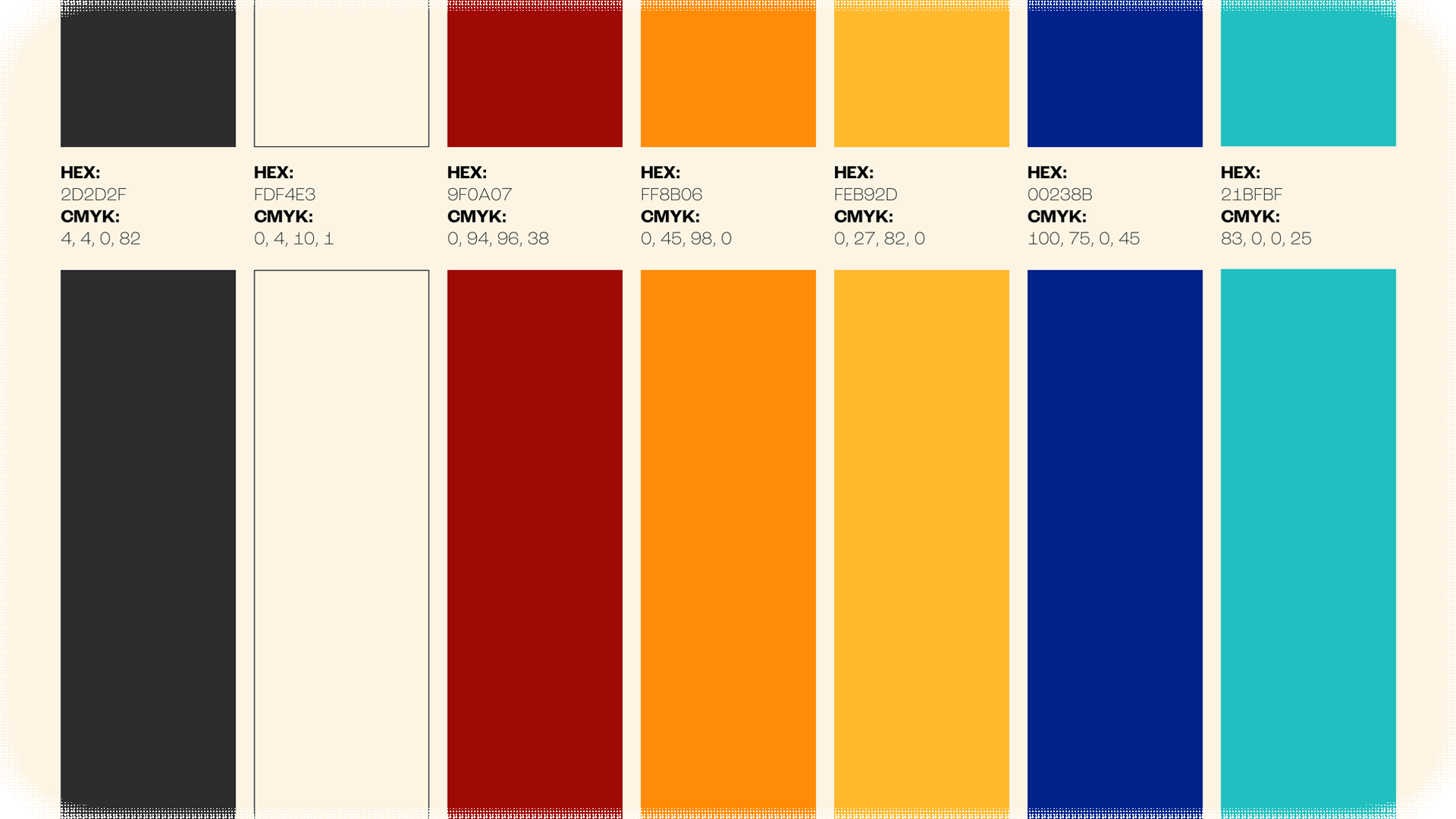
Colors
We wanted to pull from the culture of San Antonio itself while paying homage to traditional bright and saturated; mimicking the feeling of a mural in the sunlight of the summer.
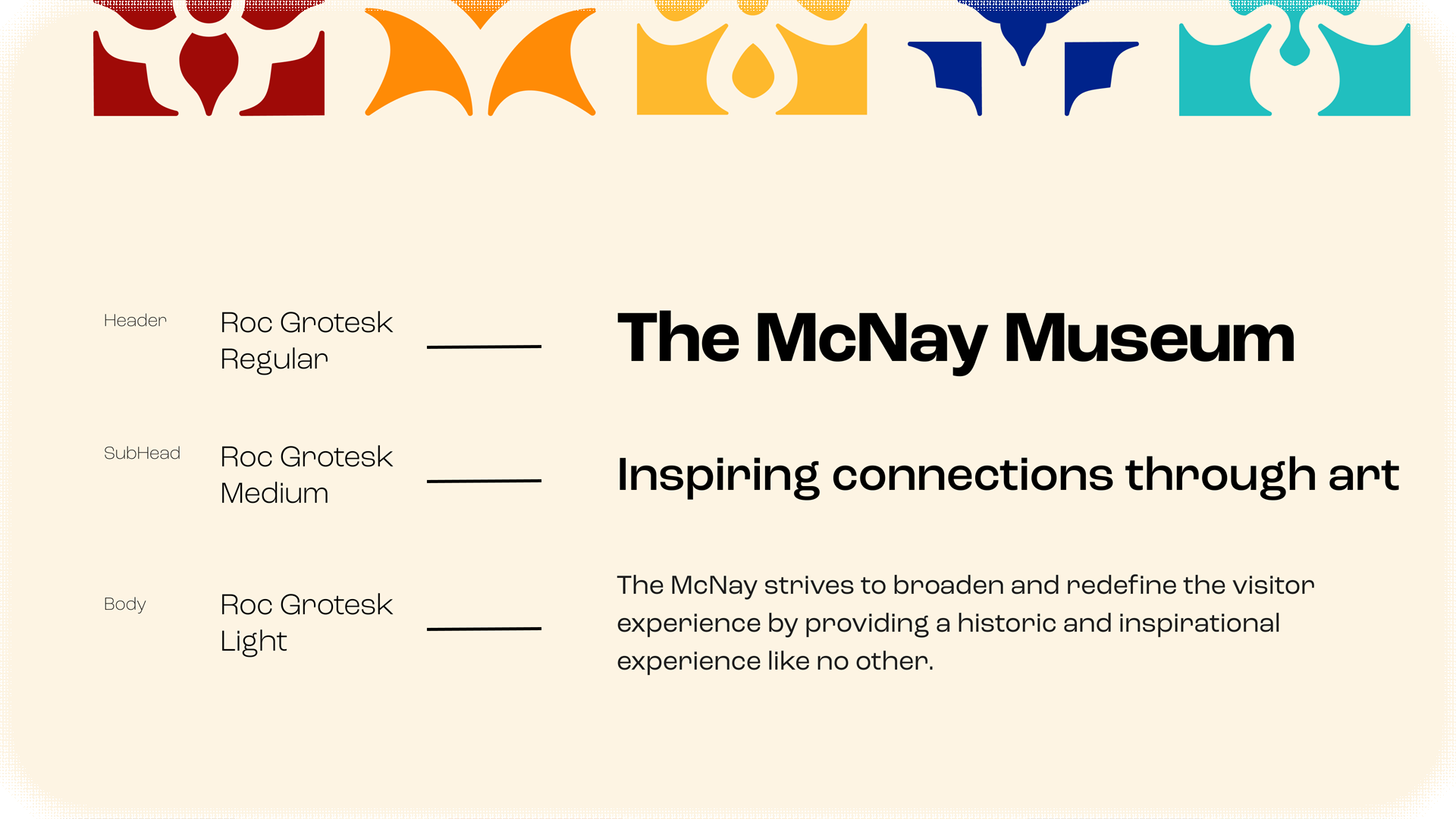
Typography
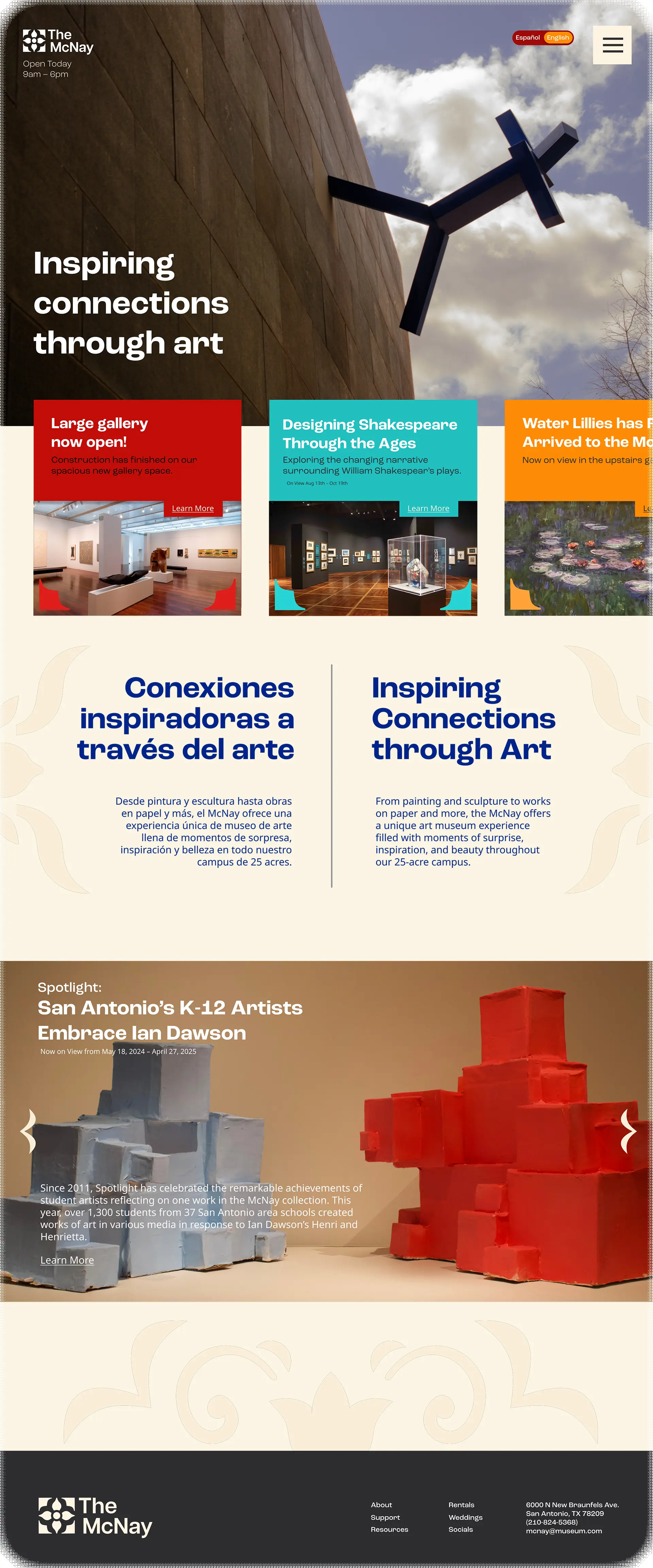
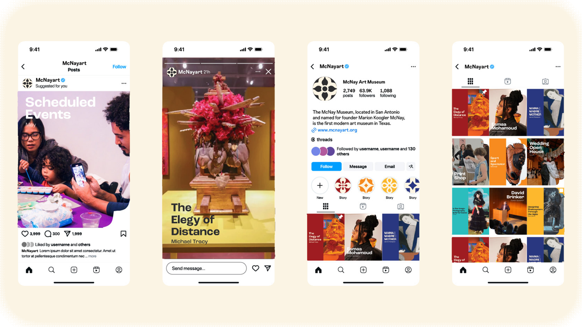
4. The Website
5. The Advertisements
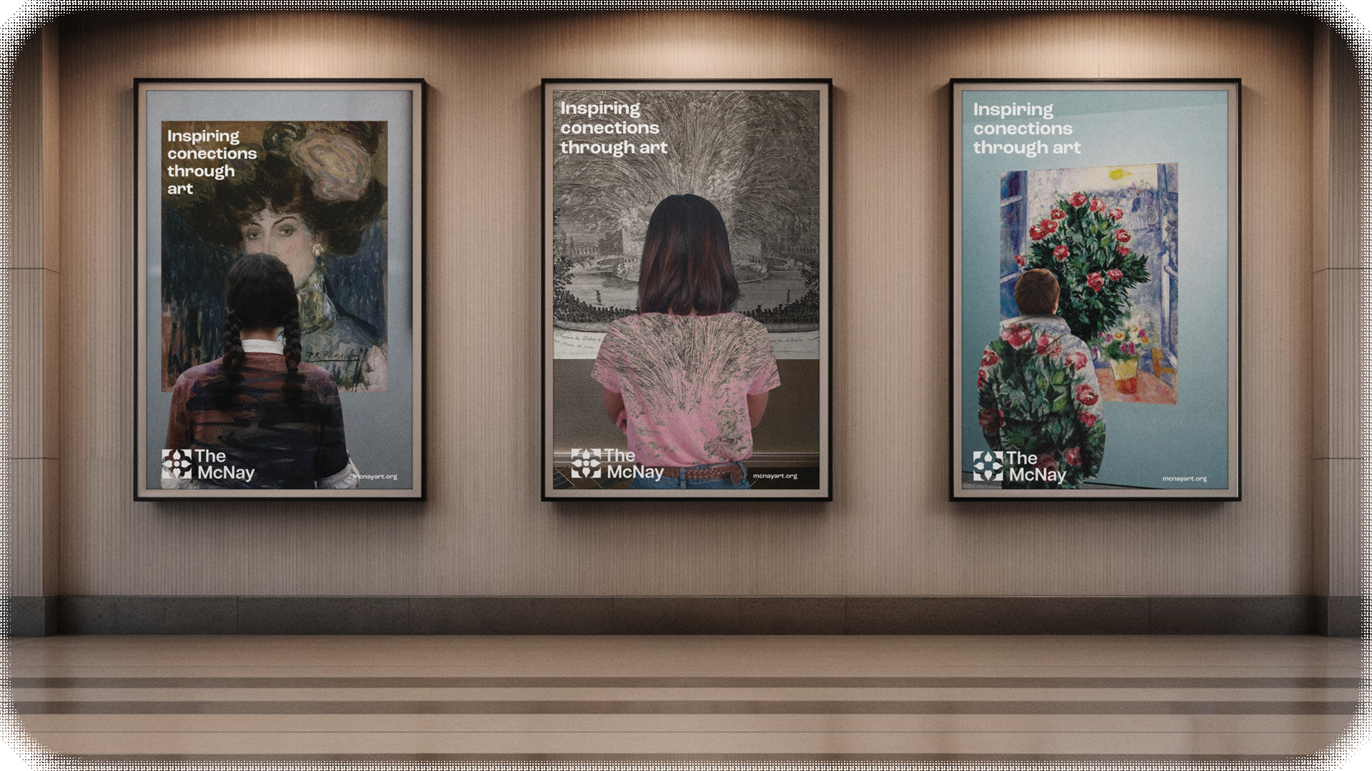
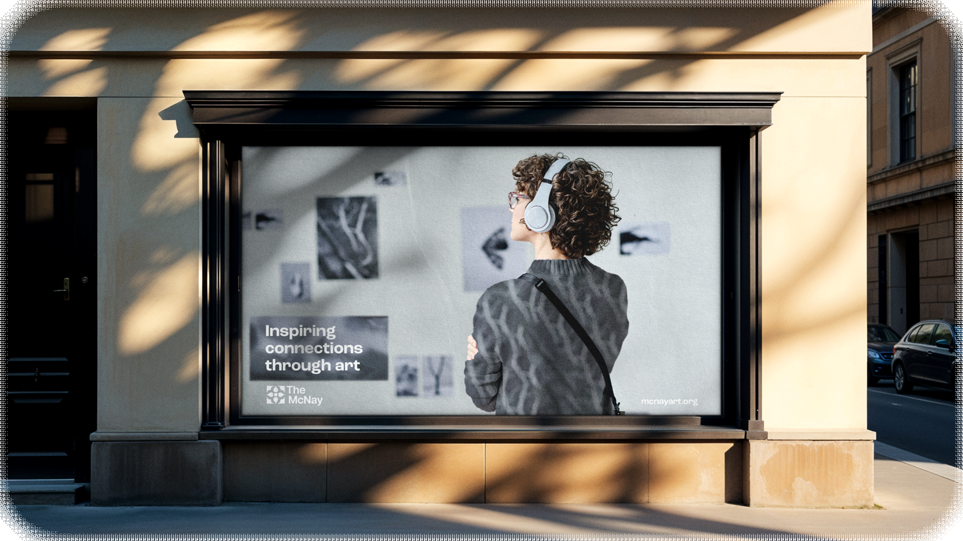
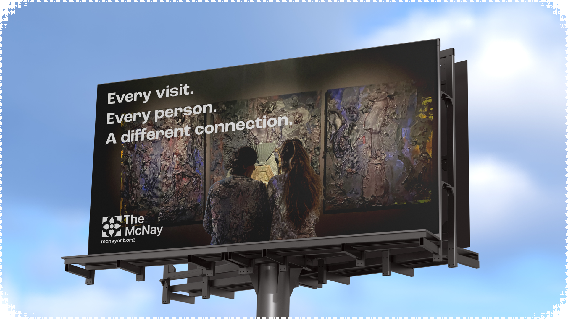
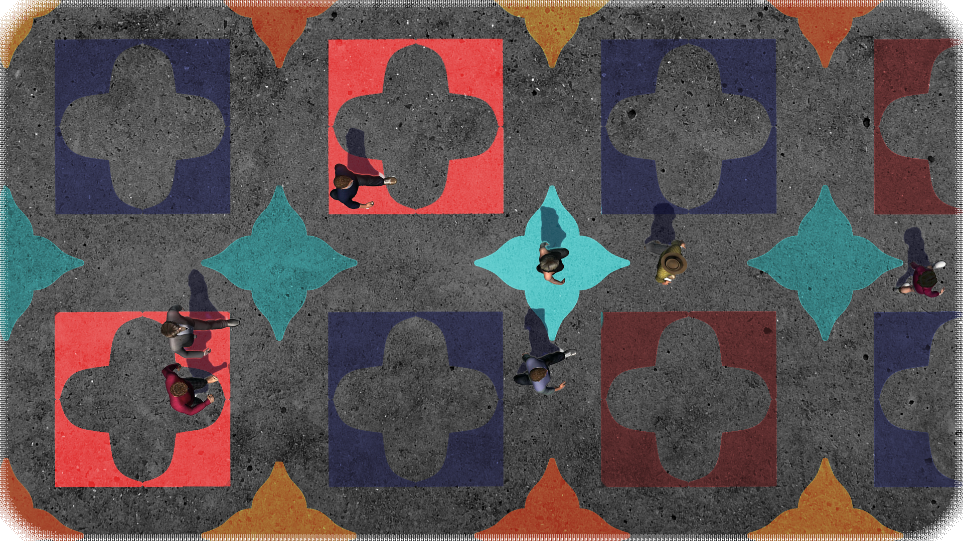
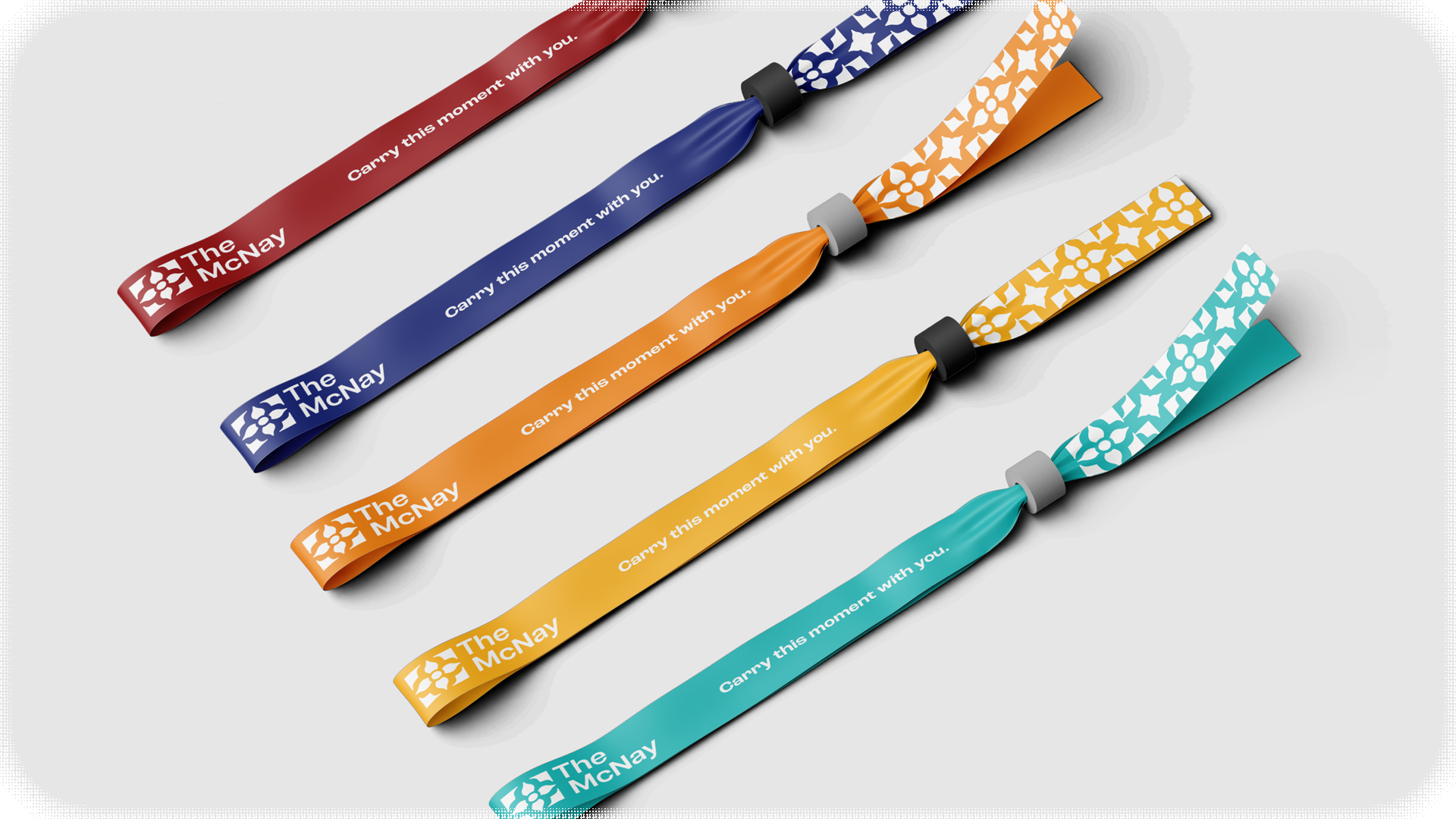
Our overall ad concept came from the idea that people are constantly making connections with the art they see and carrying it with them. In this case, on their person. The idea itself pulled inspiration from Stefan Draschan's project People Matching Artworks; in those visitors unintentionally blend into the art surrounding them, forming a visual connection even if they don't see it themselves.
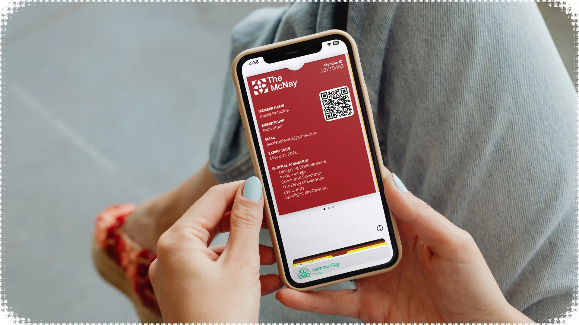
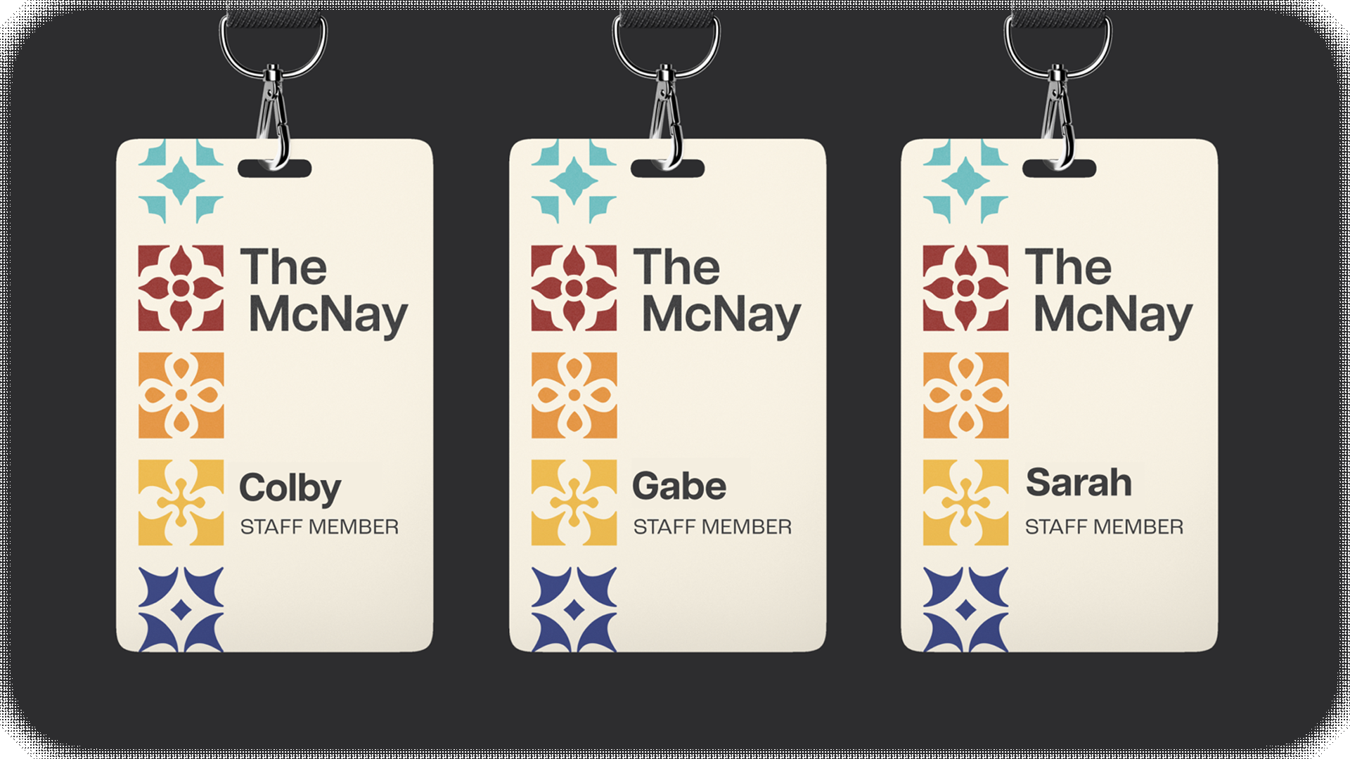
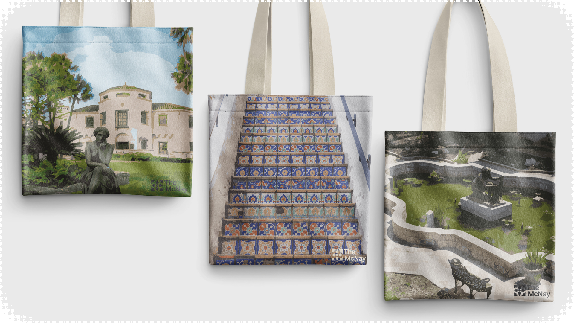
6. The Assets


© 2026 Christian Mahoney, Ursine Design. All rights reserved.